There are a lot of stages and complicated terms in the product development process. For users and stakeholders, it can be tricky to tell the difference between an MVP and a prototype and understand their use cases. You might have heard them used interchangeably, but they actually mean different things and different stages of the product development process. Let’s clarify the confusion and understand why a company might build a prototype or a minimum viable product.
A Prototype is basically a mock-up of your product, used mainly to visualize how it will look and function. Prototypes are usually built in the early stages of software development, after validation of the idea or a Proof of Concept phase. It mainly represents the vision for the future digital product and consists of UX/UI elements like user interface, UI kit, and some colour-scheme guidelines.
Prototypes are typically built to test and validate specific designs or concepts before committing to full product development. They can vary in complexity — from simple sketches to interactive models, but they are always far from being the final product. A prototype may or may not contain any core features, and while some are created for internal use, others are tested by real users to receive feedback.
Prototypes usually are:
There are quite a lot of differences when comparing a minimum viable product vs a prototype. While a Prototype is mainly a solution for testing concepts and gathering feedback on the design, an MVP is a real, working version of the product that is ready to be launched and used by real users. In most cases, it’s still not a full-fledged product and contains only essential features to be tested on the target audience. These two products differ by purpose, functionality, user feedback, development stages, and risk levels.
The quickest way to decide is to understand what you want versus what you have. For example, use a prototype when:
You should use an MVP:
Although, there’s always a temptation to cut expenses and save money on one of these tools, prototypes and MVPs are both important stages in the product development journey. While prototypes help you refine your ideas and ensure that what you’re building is user-friendly and desirable, MVPs help you test its feasibility, see if your product idea has real value in the market, and monitor its performance in the hands of users. Utilising both allows you to satisfy business stakeholders and user preferences and combine their needs into one product.
Although MVPs and prototypes are different tools, they are equally valuable. While a prototype helps you to quickly test ideas and designs, an MVP provides feedback from real users based on their actual use of the functional product. Both of these tools have their value, and using them in combination can help you find the right idea, test your approach, and create a basic product in a short time using an iterative process. They can also decrease your risks and development costs — after all, it’s much cheaper to build something people will gladly buy and use than developing a piece of software and realising that nobody needs it. Leveraging an MVP and a prototype approach is your chance to avoid this failure and create a convenient, user-oriented product.
Software development is always associated with extensive testing. This market is extremely competitive, and for many potential customers, nothing short of perfection would suffice if such a thing were possible. At the same time, startups want to accelerate their time to market and ship at least a basic version of a product to their audience as soon as they can. That’s even more true for companies that create mobile applications.
Mobile apps must look and feel great and engage users from the moment they see the app’s icon in the App Store/Google Play. According to AppsFlyier, 1 in 2 apps are uninstalled a month after being downloaded, and usability issues — problems with navigation, unclear interfaces, input difficulties, and so on — are the largest reason for it.
A digital product of high quality must work smoothly and deliver the expected results. To achieve this, rigorous testing must be performed to detect and then eliminate code errors.
In this article, we will take a closer look at the types, stages, and challenges of mobile application testing.
There are primarily three different types of mobile applications, and they vary in their design, compatibility, and functionality across different platforms. Understanding the types of mobile applications is crucial for an effective testing strategy.
These types are:
Native apps: These are mobile applications designed and developed for a specific operating system (iOS or Android). They provide optimized performance, reliability, and access to device-specific features.
Web apps: Web apps, on the other hand, are accessed through a web browser; they do not need any installation on your local computer, which makes them platform-independent. However, it is completely dependent on the user’s device’s browser.
Hybrid apps: Hybrid apps combine the elements of web and native apps into a single solution. Additionally, they offer cross-platform compatibility while leveraging native device capabilities.
Testing methodologies for each type of mobile application may differ, as each type has its unique characteristics and requirements.
There is no one-size-fits-all framework or approach when it comes to app testing. In general, it usually includes the following steps:
The first step is to prepare for the process: testers figure out what needs to be tested in mobile apps and how it’s best to test it.
Mobile app testing is quite extensive because of device fragmentation, the necessity of backward compatibility, and so on. It’s vital to prioritize at the planning stage: test the core functions of the app — on all levels — on core devices with several connectivity modes.
For mobile apps, QA teams — apart from planning to test if the app works how it’s supposed to — usually also consider device combinations to test with the app; emulators & simulators they’re going to use; and UX differences on various mobile platforms they need to go through. So, the test analysis process includes figuring out testable features, conditions in which they have to be tested, and priorities for future testing. QA specialists create use cases for test creation: scenarios for testers to utilize to look for mistakes in the app (if they do manual testing) or to use in a script (for automated testing).
The iterative development cycle requires at least unit & integration testing done at the end of each cycle, by developers. They’re included in QA activities but usually aren’t considered in conversations about a step-by-step description of the process because the step-by-step format implies linearity.
It’s also vital to have guidelines for quality control to look for flaws in the app’s structure from the beginning and start doing field tests and run tests for various types of input sensors, devices, screens, and environmental conditions as early as possible.
Developers and testers can effectively design high-quality test cases covering a wide range of scenarios by understanding various test design techniques, ultimately improving the overall quality of mobile apps.
The following are the different test design techniques used by testers to ensure the quality and reliability of mobile applications.
Boundary value analysis (BVA): In this method, testers test the values at the edges or extremes of expected inputs, like checking if the app handles entering "0," negative values, or a very large positive number in a quantity field.
Equivalence partitioning: This technique helps us divide the input values into various groups where the app's behavior should be consistent. For instance, test a login form with valid usernames and passwords, then invalid ones (empty fields, incorrect formats).
Pairwise testing: It combines a test combination of two input values to uncover interactions that might cause issues. For example, test a shopping cart with different product combinations and quantities.
State transition testing: It focuses on how the app behaves as it transitions between different states, e.g. switching among screens or logged-in vs logged-out. This helps identify potential problems during state changes.
This stage includes the QA team collecting mobile app testing tools necessary for testing. Testing can be manual and automation-driven, the mobile app testing tools for both are used across various test levels, for various testing types.
Test automation for mobile apps is a bit different from that for desktop or web-based software. There are test scripts, too, but to make the app on a mobile device “available” for testing from a computer, QA engineers need a so-called “driver” — a program-in-the-middle that “drives” code in IDEs to devices (or an emulator; or a “device cloud” — a cloud-based playing field for testing an app).
There’s UI Automator, a driver for Android applications crafted by Google, and XCUITest, a similar tool for iOS devices and Apple’s XCode. Those are used for native mobile apps. For cross-platform apps and hybrid mobile solutions, testers implement cross-platform tools like Appium, which “transform” test commands to the language of “native” drivers of iOS and Android.
Many other mobile app testing tools are available for automation testing, and they are becoming more accessible and widespread. If in the past, automated testing for mobile apps was a choice of companies who had large-scale projects and large budgets, now, even small startups find themselves suitable open-source tools for it: software for UI tests, a testing framework for security checks, other “drivers” for native and hybrid apps, and so on.
After the tools are selected, the test execution follows. Post-release re-testing and upgrade testing go hand in hand with developers’ maintenance efforts.
Choosing between testing on real mobile devices vs virtual devices (emulator and simulator) is an important decision because each offers distinct advantages.
Mobile app testing on a real device is the practice of locally installing the mobile app on a real device and testing the app’s functionalities, interactions, compatibility with the hardware, and reliability. However, due to a wide variety of mobile devices to work with and test, it can be a bit challenging.
On the other hand, testing a mobile app on an emulator or simulator allows us to test the mobile app in a virtual environment. Emulators and simulators are software-driven, which means they are somewhat faster than real devices. They also allow to do parallel testing and test automation using external frameworks like Appium and Espresso.
For a successful testing strategy, it is recommended to use a combination of both real devices and an emulator/simulator.
To explain levels and types of software testing, we’ll be using classification from the 4th edition of Foundations of Software Testing: ISTQB Certification and ISTQB syllabus for mobile testers that provide a comprehensive theoretical basis for understanding these concepts.
Levels of testing form a sort of hierarchy for different test types that describe running tests. We first go through the “classic” level of testing, applicable to all software, and then we’ll talk about mobile-specific test levels that cover checking through the structure and behavior of cross-platform and native apps.
Unit tests aim to check if the smallest parts of the code are working as they should. They’re performed by developers during the software development process, not by QA specialists or testers: and, apart from code components, they test database models, classes, and data structures.
Integration tests are done to confirm different modules of the app are performing well and interacting properly with each other. The main objects of the testing on the integration level are subsystems, databases, APIs, and microservices. Integration tests also detect flaws in how the app's interface is built. They are done by engineers and/or technical architects as well.
System tests aim to confirm the functional and technical integrity of an entire app’s system. Testers also check if the app’s working properly in the production environment (i.e. within a chosen mobile OS), if it behaves as expected according to specs, and so on.
Acceptance tests make sure that the app’s development process delivered its promises: to the stakeholders and to users — and check if it aligns with the business model that underlines its creation. In other words, various types of acceptance tests aim to confirm that the app a) works as it should for users, b) aligns with stakeholders’ specs, c) complies with regulatory requirements, and d) maintains high performance.
Field tests represent a mobile-specific level of testing that ensures the app is working well in every condition. That includes testing the app within different types of connection (cellular, Wi-Fi), signal strength, models of mobile phone, etc. Field tests also include testing the app on target devices within different environments.
Testing for an app store approval and post-production. This is another specific level of testing that’s usually reserved for the final iterations of development cycles. Tests here are usually checklist-based and aim to make sure the app follows the guidelines from the target application store that’ll ensure the app’s release. This stage includes, for instance, checking if the app follows the UI requirements of the store, connects to the store's libraries and APIs, etc. That level also includes post-production testing: running tests for the app that’s published in the store already — for instance, tests related to updates and upgrades.
Now, we’ll go through different test types.
During functional testing, developers (for some of the types of functional testing) and testers determine whether software performs all the functions it must per its specifications. The functional mobile app testing method includes the following testing types.
Interoperability testing. Interoperability testing for mobile apps includes checking how the app handles interruptions; whether it is functional on different versions of operating systems; the way the app interacts with other apps (e.g. if API integrations are set up correctly), and so on.
Regression testing. Most applications are ever-evolving. Over the course of their existence, they get changed and updated multiple times. Regression testing is performed whenever source code is modified to verify that the software is resilient to the change and that no unintended impact is caused. The process can be partially automated.
Smoke testing. Smoke testing, also known as build verification testing, is a mobile app testing method that primarily runs tests on a new build to ensure the basic functionalities are functional and aims to find major issues that could potentially prevent further testing.
Sanity testing. Sanity testing is a subset of regression testing and is usually performed after smoke testing on a stable build of software. It ensures that the code changes made have not caused any unintended issues and that the basic features are properly functional as expected. This helps us ensure the integrity and stability of the applications.
Non-functional testing is checking how the system — in this case, an app — behaves.
Usability testing. Usability mobile app testing helps identify shortcomings in user experience (UX). The goal is to understand whether the software is easy to navigate and simple to use from a user’s standpoint.
Performance testing. Performance testing is used to determine how fast, stable, and reliable an app is. The common metrics here are memory consumption, performance speed, data transfer speed, sustainability, and others. Some of the widely used subtypes of performance testing are:
Compatibility testing. Typically, software is created to work on multiple devices and be compatible with different operating systems. For most mobile applications, being compatible with both Android and iOS platforms is a must. Compatibility testing ensures that an app works great on every device, no matter the operating system, screen size, and so on.
Recovery testing. This type of testing checks the app's ability to recover after a failure. Common reasons for failure may include hardware and network issues such as server unavailability, power outage, etc. These situations are simulated to observe the system’s behavior — for example, how it restarts and whether there is any data loss.
Security testing. Security mobile app testing is used to assess how vulnerable an app is to malware attacks or unauthorized access. Several types of security tests should be performed:
Interrupt testing is one of the most important testing methods, simulating real-world scenarios where a mobile app during usage can get potentially interrupted by various factors, from a low battery notification to an incoming call. The goal of interrupt testing is to see how the app responds and recovers from these scenarios.
The following are some of the interruptions that are faced in a mobile application:
System notifications: These are the notifications or warnings from the device OS, such as low battery warnings, app update reminders, security alerts, etc.
User-initiated interruptions: These are the actions initiated by users, such as incoming calls, text messages, notifications from other apps, etc.
External factors: These are interruptions caused by external factors such as network loss, connectivity issues, device orientation, plugging or unplugging chargers or headphones, etc.
Localization and globalization testing are essential processes to ensure that the mobile application functions are seamlessly functional and accessible to different regions and cultures. Localization testing focuses on adapting your app for a region or culture, including translating text and formatting content according to local preferences.
On the other hand, globalization testing prepares the app for global audiences by ensuring it can handle various languages, date/time formats, currencies, etc.
Cross-platform testing verifies that your app functions are properly functional across different operating systems (iOS, Android), screen sizes, and device types (phones and tablets). It improves the user experience and maximizes the app’s reach and usability. The goal of cross-platform testing is to identify and address any inconsistencies or compatibility issues that might negatively affect the user experience on specific devices or OS versions.
It is worth noting that there is no universal categorization of testing types. For instance, usability, performance, compatibility, and localization testing are sometimes grouped under the umbrella of non-functional testing. Other sources might also distinguish scalability, compliance, profitability testing, etc., as separate groups.
Test strategy — the way a company is doing testing, its main goals, approaches, and the ways it prevents risks — for mobile devices must foresee the challenges that come with the process. The number of variables and conditions against which an app must be tested in order to make sure everything works seamlessly — especially if that’s a sophisticated app, or an app that’ll be released for highly regulated industries — is, frankly, maddening.
Of course, it’s futile to try to cover everything with testing; moreover, it’s impossible and unproductive. One of the major axioms of the process is that exhaustive testing is not real. But, if you know where the roadblocks are — where to look for flaws — there’s still a good chance of making it work well.
There are dozens of mobile device manufacturers out there. Moreover, the number of different device models fabricated by some brands, such as Samsung, is enormous. Most phones run either on iOS or Android, but the differences between all the mobile models go beyond operating systems specificities alone. The vast array of phone units having different technical specifications presents a significant challenge.
This challenge can be tackled via many approaches. There are bug-hunting activities testers — and people who want to assist in the hunt from the company — can do across as many devices as possible. There’s choosing target devices — several models that are majorly used by the app’s audience (this cannot be done without some market & user research). QA teams also often opt for using “device clouds” and emulators; they, too, allow testing the app on different, albeit virtual, devices.
Different devices mean different screen sizes. A subset of the challenge is closely related to UI, and the way not tracking splits within a user interface across different versions of Android OS may result in users’ dissatisfaction and drop-offs.
Developers approach this challenge, for example, by employing modularized UI components or using responsive width and height instead of hard-coded values. QAs’ job then is to make sure it works. Various app testing tools facilitate this process, too.
The recent invention of foldable screen technology is an extra complicator. Now, testers have even more non-standard screen layouts to check. Google even released a guide on how to test apps on foldables to give testers a hand of help.
Meeting the constantly increasing demands of users is an additional issue. Testers tend to use the same metrics of, for one, performance, for years. But expectations are regularly raised by companies that improve speed, stability, and other software characteristics. So, competitors start having trouble keeping up.
To meet user demands, companies run surveys and examine the newly released apps’ functionalities. That’s why community managers and product teams must collaborate tightly post-release. Community is a rich source of feedback that gives direction for further testing activities.
Application Security Testing (AST) is crucial for multiple reasons. Unfortunately, cases of identity theft, malware infection, crypto-jacking, and other security breaches are not unheard of and are even more common for mobile software than for desktop programs. Moreover, apps that handle sensitive user data or deal with financial assets are at a high risk of a cyberattack.
Some app testing tools can help with basic and medium-level intensity security testing. It’s also recommended to do exploratory and checklist-based testing using, for instance, known mobile security vulnerabilities and the latest exploits.
Users expect an app to consume as little battery power as possible. But it is frequent that software is fitted with vast functionality, leading to extensive battery usage.
QA engineers focus on the functional changes that can decrease battery usage without compromising performance. For one, the display is the most greedy user of energy in mobile phones. The common way to tackle the problem is to introduce a night/dark mode.
Besides, the energy consumption of software running in the background mode can also be optimized. For this purpose, developers defer unimportant operations of an app to limit background CPU and network activity.
For memory- and storage issues, engineers do stress, temperature, and security testing within the field testing level.
Testing software is a crucial process that requires diligence, attention to detail, specialized knowledge, and access to the right tools. Here are some additional useful tips that QA analysts and testers should keep in mind:
Testing coverage is the number of tests and their scenarios. The main objective here is to meet Functional Requirements Specification (FRS), Software Requirements Specification (SRS), and User Requirement Specification (URS). It’s important to make informed decisions about what tests to include while creating a test plan. These should be based on the budget and the priority of the requirements.
There is good practice for achieving maximum testing coverage within a tight budget. QA specialists should divide the app’s functionality to be tested into small modules. Then, a reasonable combination of tests and their scenarios is selected for each of the units. Such an approach helps avoid unnecessary or duplicate testing and increases the cost-efficiency of the project.
In real life, the software does not operate under ideal conditions. So, it is important to run positive and negative scenarios. The difference between them is that the latter receives the invalid/improper datasets as input instead of the correct ones. Conducting negative checks allows testers to predict software behavior and potential crashes.
Most apps operate under the client-server model, meaning that they have a fully functioning app downloaded on their phone, which at the same time can contact centralized servers to get access to the latest and most relevant information. When running tests, it is important to make sure that both client and server-side code functions correctly.
Sometimes the test plan does not have all the combinations of scenarios. It usually happens with innovative, feature-rich app development. Alternatively, some combinations of tests and scenarios may not work as expected for some reason. In any case, it’s sometimes useful to take a different perspective: for example, choose another framework or a mobile app testing tool, perform testing manually instead of automatically, etc.
Once again, the main goal is to ensure maximum test coverage. For this purpose, test cases should be done during the analysis and design stages of product development. This way QAs have enough time to verify the validity of all the requirements.
Emulators save time and resources at the early stages of the development lifecycle. However, testing on real mobile devices is crucial when it comes to proper quality assurance. Only they can give truly realistic results.
Application development cannot exist without quality control and extensive testing. Software testing is a rigorous, multidimensional process that starts by creating a proper test plan and outlining a strategy. If executed correctly, mobile app testing has a valuable impact on the quality of the final product, user experience, and cost-effectiveness of the project overall.
The selection of proper app testing tools and strategies is important. However, the expertise of software developers and testers is what truly plays a paramount role in mobile testing. If you need help with QA, contact Diversido with your project’s details.
Have you ever wondered how apps like Duolingo keep you coming back day after day, or why Fitbit makes achieving daily step goals feel so rewarding? Their main secret lies in gamification, which consists of adding game-like elements to non-game apps to make them more fun and engaging. Whether you're building an app, designing a website, or even managing a classroom, gamification can help motivate people, enhance learning, and create memorable experiences.
But where do you start with gamification? You can begin this journey by employing the core game elements that include:
Gamification is important in modern design as it boosts user engagement, enhances retention, increases motivation, and improves brand loyalty. To easily add gamification elements, designers and developers use specific gamification frameworks that provide structured ways to design unique experiences that keep users engaged. In this article, we’ll walk you through some of the most popular gamification frameworks, explain how they work, and help you find the right one to ensure your project breaks a record in user engagement.
Creator: Yu-kai Chou
Overview: The Octalysis Framework created by Yu-kai Chou is one of the most well-known gamification frameworks out there. This framework describes the main reasons people engage with games and similar activities into eight core drives of human motivation. These include:
How to use it. The Octalysis Framework can help you better understand your target audience. Get to know the players, identify which of these core drives is most important for them, and design experiences that tap into these motivations. For example, if your audience loves competition, focus on “Development & Accomplishment” by adding levels or leaderboards. Or, if the users are socially driven, consider features that encourage collaboration or sharing to make them feel this sense of online community.
Creator: Andrzej Marczewski
Overview: Another convenient gamification framework is GAME, which provides a straightforward, 4-step process to help you create meaningful gamified experiences. These four steps are Goals, Actions, Motivation, and Engagement:
How to use it. The GAME Framework is for you if you’re only at the beginning of the gamification design process. It can offer a clear roadmap, and help you to think through what you want to achieve and how to make it happen. For instance, if your main purpose is increasing app usage, you might motivate users with badges for daily logins (actions) and monitor their engagement levels to adjust the difficulty or rewards accordingly.
Creators: Robin Hunicke, Marc LeBlanc, Robert Zubek
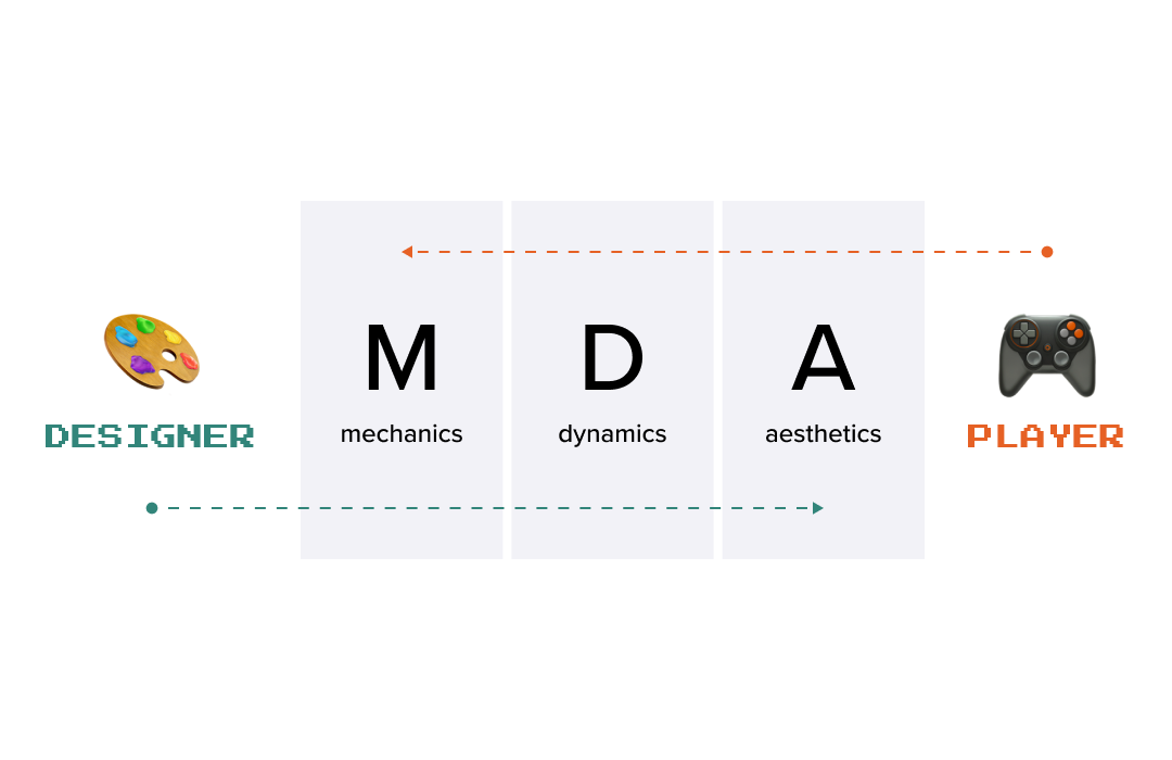
Overview: Oftentimes, game design frameworks can be used for app gamification as well. The well-known MDA Framework is one such framework, which was first developed with game design in mind, but turned out to be quite flexible and worked for gamification. This straightforward model breaks down the game experience into three key components and builds on them:
How to use it. This framework can help you realise how the different parts of your gamification strategy work together. To use it, it’s best to start thinking about the end result first, namely — what emotions or experiences (or aesthetics) do you wish your users to have? Once you figure that out, you can start to go backwards to figure out the Dynamics and Mechanics needed to make that happen.
Creator: Gabe Zichermann
Overview: SAPS is more about the rewards system as it highlights four types of rewards that can be used to motivate players and keep them engaged. The SAPS abbreviation stands for:
How to use it. Although it can be difficult to gamify the whole app with the SAPS framework, it certainly comes in handy when you’re creating a reward system. Start by figuring out what kind of rewards drive your audience the most — if the users love being recognised for their success in the game, focus on “Status” by offering badges or special titles; if they’re more motivated by exclusive content, lean into “Access” to keep them engaged and coming back; “Power” is for more power-driven people, giving them the chance to execute it; and “Stuff” can be a nice addition to the other rewards.
Creators: Edward Deci and Richard Ryan
Overview: The SDT Framework requires a deep knowledge of the target audience since it is built on the concept that people are driven by three core psychological needs:
How to use it. To boost the most basic feeling of motivation, aim to create gamified experiences that satisfy people’s needs. For instance, if your audience is more autonomous, let them pick their own challenges (Autonomy), provide them with the needed feedback to help them grow and improve their knowledge (Competence), and incorporate various social elements like a team challenge to build connections with others (Relatedness).
Creator: Nicole Lazzaro
Overview: The 4 Keys 2 Fun Framework by Nicole Lazzaro is built on the notion that there are four different types of fun that people enjoy, and therefore tend to engage with more:
How to use it. This framework can help you create a balanced experience. For example, the implementation of puzzles or challenges for getting “Hard Fun” is balanced by the “Easy Fun,” which is less difficult to earn; “Serious Fun” suggests meaningful missions, and “People Fun” enables social elements like group chats or competitions.
Creator: Richard Bartle
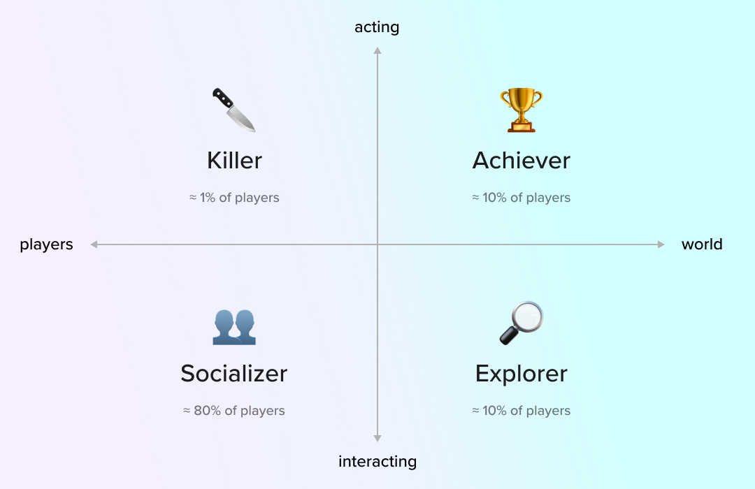
Overview: Bartle's Player Types is a gamification design framework that works by categorising players into four types:
How to use it. This framework helps tailor your gamification approach to different user personalities. For it to work, you must research your target audience and use the gathered data and metrics to categorise them. If your audience is full of “Achievers,” create a rich levelling system and leaderboards; for “Explorers,” provide hidden content or unexpected rewards; “Socialisers” will enjoy chat features and team missions, while “Killers” will definitely engage with competitive elements.
Creator: Nir Eyal
Overview: The Hooked Model framework helps to create gamified systems that will sort of form habits in users by guiding them through a four-step process. It contains the following game mechanics:
How to use it. The Hooked Model is a perfect tool for building products that users return to regularly. If you want to utilise it, start by identifying the triggers that can bring users back, design simple actions they can take, offer different rewards to keep them engaged, and encourage investments to increase the chances of their return.
Creator: Kevin Werbach and Dan Hunter
Overview: The 6D Framework is more of a game designer practical guide to gamification. It outlines six steps for implementing gamification into your design process:
How to use it. This framework is like a checklist for adding game design elements. Follow these six steps to craft a gamified experience that aligns with your business goals, keeps your users engaged, and suggests a fun pastime.
Gamification isn’t always easy and requires a lot of work and dedication from the designer. Luckily, there are specific frameworks that help to highlight the goals, determine the gamification mechanics, and get to know the users. The GAME Framework is a great starting point for those who only begin their journey. The Octalysis Framework or Self-Determination Theory will provide deeper insights into users' motivation and core drives. The SAPS Framework might be your best bet if you’re keen on the rewards, and the Hooked Model can guide you to building a habit-forming product.
In gamification, there’s no one-size-fits-all solution, but by understanding the users better and learning about their needs and values, you can design engaging experiences that will keep them wanting to come back for more.
Happy gamifying! 🎮
Working with software developers for the first time can feel like diving into the deep end of a pool without knowing how to swim. Many unfamiliar terms, tools, and processes can make you feel overwhelmed. But don’t worry! This guide will help you spot the “green flags” (good signs) and “red flags” (warning signs) at different stages of the development process to make your journey smoother and more successful.Whether you’re hiring a small business or a large corporation for your app development, you are running a risk of misaligned goals, miscommunication, and, eventually, lost profit. Choosing the right team is key to success; that’s why it’s important to pay attention to some factors that can mean a good or a bad sign and save you time and costs in this endeavour.
The mobile app development process generally consists of 4 development phases:
Each of them has its intricacies and pitfalls, and, as a business owner, you have to be aware of them and the signs to look for during every stage. Let’s take a look at the most common green and red flags inherent to the phases.
Although the pre-start phase doesn’t do a lot with the app development, it still can’t be avoided. It includes all the main things you have to agree on before the coding begins. Think of it as laying the foundation for a house. A strong foundation sets you up for success, while a shaky one can cause problems later.
After you’ve agreed on the main terms and conditions and made sure everyone is aware of the plan, it’s time to start the app development process. This is when the main phase begins, and you get an opportunity to test the coding skills of the chosen app development company. During this time, it’s important to keep an eye on how things are progressing and set clear milestones or inspection times when you can check on the project's progress.
Two months of development time is usually enough to start seeing some tangible results of the work done. Here’s what you can check:
In most cases, especially when it comes to simpler mobile apps, the application development process during this phase is close to an end or the app might have been launched already. But in any scenario, six months in, you should have a clearer picture of how things are going. Here’s what to look for:
Working with software developers for the first time can be daunting, but by keeping an eye out for these green and red flags, you can navigate the process more confidently and effectively. Remember, good communication, clear documentation, and regular progress checks are your best allies in creating a successful software product. Happy developing!
So, 2016 is ending, and it is a good time to look back and do a little retrospective what this year brought Diversido Mobile and the team. It was a year full of changes, unexpected events, inspiring success and recognition and, of course, new great people!
The whole crew came to Kyiv, and we had two days shooting in the office, in the flat, on the city streets, that was a lot of fun!
The resolutions for 2017 would be:
On Saturday 28 of January, I attended BDMSummit – local business development conference taking place in Kyiv. Four stages – Sale like a PRO, Outsourcing Hero, Marketing & Branding, Workshops, 300+ attendees, 30 speakers – not a huge event, but I brought a couple of useful insights and met interesting people there so I can say it definitely worths visiting.
All speakers whose presentations I attended were great, but I have selected three that I liked the most.
Helen Petrashuk from Seductive mobile gave an inspiring presentation about effective attending the conferences and meeting new clients there, shared her calendar of events and useful tips how to save on business travels.
Lively and hilarious presentation by David Brown from TemplateMonster kept the audience active, smiling and inspired. David was talking about an importance of your personal and professional network, a necessity to stand our of the crowd and bring your creativity into everyday work. His 5-step system of networking makes a lot of sense:
Igor Luzhansky from Neadevis in his presentation described benefits of working with partners, listed types of them and ways to work efficiently with each group, advantages, disadvantages and where to find them.
But the summit was not only about presentations, but more about people and networking. That was a pleasure to meet old friends there and discuss news in their and our professional life.
Afterparty in “Fog Area” allowed to meet participants and speakers in more informal surrounding, talk through different situations, address some questions, get valuable advices and inspiring ideas, and just have fun 🙂
Ideas, insights, and notes I brought from the event:
Books worth reading:
I am happy to announce our partnership with Abdo Riani, a speicialist in startups and tech, who initiated and was involved in the launch of over 50 startups. His startup journey began almost 8 years ago, when he learned how a few lines of code can make such a big impact in people’s lives. He is currently the founder of AspireIT, MVSOT and Upify, an agency and two startups that provide passionate entrepreneurs with all the necessary resources to turn ideas into valuable and viable startups.
Through his personal website, AbdoRiani.com, Abdo is on a mission to help startup founders connect the dots about what it takes to build a scalable startup. The Startup Guides, Bootcamps, Posts, Infographics, Resources and other tools are designed to help the first-time founders make sense of the scattered startup knowledge out there on the internet, in one single source. With just an interest in entrepreneurship, founders are taken through the startup journey with methods, frameworks, bootcamps, examples, tools, tactics and strategies.
For founders that are eager to execute, an Idea Execution program is put in place during which entrepreneurs are supported to take an idea to market within 30 days.
Learn more about Abdo at AbdoRiani.com and make sure you join the Startup Community to be the first to get notified about the next Idea Execution program and ask Abdo any questions you may have.
We will work closely with Abdo to help startups grow and deliver value, share useful information and educational materials, participate in boot camps and other events. Looking forward to the fruitful partnership!
The number of healthcare apps is constantly rising. According to Statista, the App Store and Google Play have around 100,000 healthcare and medical apps (50,000 each). If you want to make your app accessible to the users and stand out among competitors, you have to ensure a good UI.
User Interfaces aren’t only about looks. The app interface shapes the User Experience, determines how the user interacts with the app, and helps them to navigate and accomplish their goals. In this article, we share tips and tricks to bring top-quality interface design for such products.
When designing a healthcare app, the main focus should be making it accessible to every user. A significant part of the user base can be people with disabilities like:
When choosing colours, fonts, text, and buttons, strive to make the app accessible to all ages and user categories by checking the colour contrast, the attention areas, the size of the font, and the quality of the pictures.
The colour palette is an important aspect of designing a healthcare app. Of course, it has an emotional impact on the users, but it also helps to establish the visual hierarchy by highlighting some actions and sections, reflects the company’s branding, and improves the app accessibility. Colour contrast is the most crucial aspect of a colour palette.
The common choice of colours for a healthcare app is cold tones. They seem to be calm and relaxing. However, people from different cultures perceive colours differently, so it’s always a good idea to check colour psychology and prioritise the culture of the target audience.
It is a well-known fact that different colours have different psychological impacts on us and can cause different emotions. For example, blue is often associated with calmness, focus, trust, and professionalism. And since these things are valued the most in the medical industry, it’s a go-to choice for lots of apps and services.
Blue is a popular colour in many industries, but consumers automatically associate it with the medical field. It goes for everything and not just in the digital — the doctor in your clinic will most likely wear blue or white scrubs.
Here are a few examples of such apps:
As you can see, they look pretty similar, although all distinctive as healthcare apps. That’s the main risk of using the blue colour — you might be easily associated with somebody else in the field. This doesn’t mean you can’t use blue at all – just make sure to add other colours as well, or at least some bright accents to stand out in the crowd of similar-coloured apps.
Another popular colour for medical apps is white. It is often associated with cleanliness and simplicity. However, for some users, plain and bright white colours may look a bit clinical or sterile. This can cause some subconscious fear, similar to what many feel in the doctor’s office. Plus, using white alone may work badly for accessibility — for example, users with visual impairments might find it difficult to navigate the app.
However, you can go with ivory, grey, snow, beige, and sea sand — the list is endless. To make this subtle interface more accessible and user-friendly, you can always add some bright and contrasting elements.
Like here, in these two apps. You can see that the background seems white. But if you look closely, it’s a grey colour with bright contrast elements.
Although black is not the most popular colour in the medical industry, it is also used in some cases. It symbolises trust, authority, and sophistication, which are the feelings you want your app to convey. Except for its psychological effect, the black colour has other advantages. It is readable and can easily be seen against light or colour-rich backgrounds. With the rising popularity of a dark mode in app design, black or dark backgrounds are being used more frequently even during the day.
One can also create a visual typography hierarchy using black in fonts or buttons. Overusing it may result in anxiety, so it can be paired with other calming colours, such as blue or green.
In the Apple Fitness app, black is the main interface colour. Thanks to the use of multiple bright elements, it’s still highly readable. As it’s an app mostly for running and training in the gym, it provides for better visibility in the sun. However, it can only be used by its target audience — young people who work out often, as it doesn’t look very accessible for older people.
Green colour can also be used for healthcare apps as it gives a sense of calmness and relaxation. It has a strong natural connotation, which is often seen in environmental projects and herbal medicine. If your app is more on this side, you can use beautiful shades of green to relax the user. However, if you don’t want to be associated with natural treatments, avoid using too much of this colour.
Like in this app — you wouldn't guess at first glance that it helps to fight diabetes.
It can be utilised as an effective colour to highlight some elements or actions. For example, green and red colours are often used to design buttons for Yes/No choices. Or it can bring good news about the test results or successfully submitted documents.
Here’s a good example of using green colour to show some achievement:
The red colour is rarely used for things like background or app screens. As it is really intense and has low contrast, it’s not the most visual-friendly colour. However, it is often utilised for specific elements like buttons or notifications to convey a sense of urgency and alarm the user. It can also be associated with danger; that’s why it is effective in cases when you need to attract users' attention to an important message or warning.
The red colour is indispensable when you need to help highlight some key information, but only if it’s one of the brand colours. Otherwise red shouldn’t be used in navigation as it will be understood like an error message. As it’s the first thing your eyes go to when looking at the screen, it can be helpful to urge medical providers or users to take a certain quick action, like submitting the documents for critical verification or checking lab tests errors, etc.
Like in the following screens, red colour is used to signify action or show a possibly dangerous heart rate zone.
Pink is the first colour that comes to mind when you think about apps for women's health and pregnancy, like gynaecological or paediatric services. As it is stereotypically associated with the female sex, using it extensively in other types of healthcare apps may seem a bit confusing. That’s why we don’t recommend it as the main colour for your app if you work in a different service field.
Here are examples of pink in apps. It looks nice and relaxing but is already hugely associated with women’s health.
However, using this colour to highlight some elements or important information can be beneficial as it seems to convey a sense of relaxation and fun. But it’s always better to opt for pastel shades, like the one on the screen below, since a lot of people have a distaste for a bright pink colour.
Buttons are a very important element in UI design. They can signify an important action like purchase confirmation, submitting forms, etc. That’s why it’s vital to make them visible — users can get frustrated if they cannot find the form or the button right away. And unless they have a very strong motivation to keep looking for that button, they might easily leave the app and never come back.
Making buttons visible is also a great point for accessibility. Users with visual impairments may struggle to find the button coloured in a similar shade to the background. It is also important to pay attention to the text you put on the button. For the same reason, the text should be logical and as descriptive as possible. It is considered a bad UX if a button just says something like “Press here” when it can say “Go back to the Main Page.”
Users of any healthcare app should be able to quickly and accurately read all the information presented. It could be an important notice of taking pills or calling the doctor, and if the fonts are all scribbled and ornate, they will make this task difficult. That’s why when choosing the font, you always have to keep in mind legibility. Accessibility-wise, some users with cognitive impairments or older people won’t be able to quickly read the information.
You also would want to choose a font that conveys trustworthiness and professionalism, and is appropriate for the app that deals with sensitive medical information. It’s not the best idea to use playful fonts like the ones from the Maka or View family.
Sans Serif fonts are one of the best fonts for healthcare applications. They are simple, easy to read, and yet have a modern look. They will give your app a professional look and will fit any type of information. A few popular sans-serif fonts include Inter, Helvetica, Arial, Roboto, Futura, etc.
Other important aspects of fonts are kerning and leading — the distance between the two characters and the space between adjacent lines of type, respectively. If it is too small or too large, the text loses readability and becomes difficult to recognize. This greatly depends on the UI of the app; it’s always better to personalise your configurations according to it.
Icons and images are used in most apps to make the interface more concise, understandable, and also fun. Icon elements replace text (or go together with text) to signify some app section. In a healthcare application, such sections can be a personal account, lab tests, doctor appointments, etc. They can also show some facts and actions schematically. There are a lot of intuitively understandable icons and stickers that can be found on platforms like Flaticon:
The important thing about these icons is that they are supposed to add some real value and don’t confuse the users. There’s no point in adding basic pictures and icons from free stocks like smiling doctors and patients, since they don’t add value or meaning to the interface. However, a designer or an illustrator can draw the icons and stickers to add to the app. They can be fun and recognizable, promote your brand by using specific colours, and make you stand out among your competitors.
Checklists are a great tool to highlight certain things and ultimately achieve great results. You can use the following checklist when designing a healthcare app:
UI design is a never-ending process of improving the user experience and meeting their needs. That's why it’s so important to keep your hand on the pulse, gather feedback, and study different cases and consumer behaviour. If you don’t know where to start designing your healthcare app — use the checklist to determine some milestones for your product. And if you ever need any help, you can always talk to our designers - with deep expertise in healthcare apps we can advise or even work on designs for you.
I speak with new people, potential partners and clients every week, and often I hear very similar questions about our work process, approach, specialization, etc. So, I decided to collect the most common ones, and answer them in this article, highlight how we work in Diversido.
Usually, we work either with Time and Material or Fixed-price approach.
Time and Material allows more flexibility, quick start, on-demand tasks, no need to approve and discuss the scope every time; it is the best for a long-term relationship.
Fixed-price is good for projects with a clear and settled scope, with a particular budget for the whole product. In such cases, it is very important to define the requirements very well at the beginning of the project, making sure that everybody is on the same page about the product. That is why we always start fixed-price projects with the Elaboration phase, whose goal is to define all the scope and do all the needed investigations to provide an accurate estimation.
We apply Agile best practices in our work with any collaboration approach – daily meetings, regular status updates, planning, demo, and retrospectives.
We also follow the continuous delivery principle with the Earliest Usable Product approach, perfectly described by Henrik Kniberg in his article, we try always to have a usable app and add the functionality gradually.We also follow the continuous delivery principle with the Earliest Usable Product approach, perfectly described by Henrik Kniberg in his article, we try always to have a usable app and add the functionality gradually.
Our company is registered in the UK, but development team is fully remote: we have people in Denmark, UK, Germany, Poland, Belgium, Croatia, Turkey and Ukraine.
We believe that regular communication between the team and the client is important, no matter the distance. We almost don’t have a time difference with European clients, so no special measures are needed. As for the US ones, we have about 4 hours of overlap with the East Coast, it is enough for all the discussions and collaboration. The biggest difference is with West Coast, but we successfully have our daily meetings at the end of our day and at the beginning of theirs – to catch up, discuss the questions and make needed decisions.
Transparency and effective communication are our values, so developers always communicate directly with the clients on regular calls and in slack channels. We use task boards (JIRA or Trello), which are always up to date, with all the tasks statuses. We encourage clients to have regular calls with the team – at least weekly, ideally – daily.
We provide full-cycle web and mobile applications development – from idea discussions and wireframes to publishing to production and app stores. We have designers, product managers, back-end, front-end, mobile developers, QA enigineers, and project coordinators in the team, so we can handle any development task.
Our technologies of choice are Node.js, ReactJS, Flutter, Xamarin, Maui.
Sure, all our fixed price quotes include two months of critical issues fixes. After that, there are two possible approaches – either some reserved amount of support hours per month, when we keep people available for any tasks within the allocated time, or support on-demand when the rates depend on the urgency of the tasks.
To evaluate every project, we initiate the Elaboration phase during which we do all the needed research and provide an accurate quote. Our rates vary from $30/h to $75/h, depending on the specialist’s level.
We specialize in a few areas – Healthcare, Gamification, IoT, Entertainment and Education, have been working in each of them since 2013. We are HIPAA compliant, have a lot of experience with wireless devices connectivity, EHR and EMR systems, Gamification in Healthcare and Education.
We have 38 people in the team, and if needed, we can hire dedicated developers for the project – the average period of finding the right person is one month.
Our work history and clients’ feedbacks could be found on Upwork, and Clutch. We also can provide our clients’ contacts for reference.
If there are any additional questions you’d like to ask, or you have some ideas to discuss, let’s have a brief call. You can book a meeting with us via calendar below!
The fitness app market is growing at a rapid rate. In the USA alone, the number of users raised from 68.7 million in 2019 to 86.3 million in 2022. This growth is driven by the increasing popularity of wearable technology and cloud-based services, which are driving down costs for both developers and users.
However, there are still many challenges for app developers who want to enter this space. Building a fitness app requires extensive knowledge about how different pieces of technology work together — and learning them also requires time.
In this guide, we'll walk you through everything you need to know about building a fitness app: from choosing the right goals and audience to making sure your user experience is top-notch. We'll also cover some of the most important features your app should include and how they can help your users achieve their goals faster!
Fitness applications are a perfect choice for those who wish to learn how to exercise or improve their current level of fitness. They provide guidance, motivation, and instruction in a convenient format that is easy to use at home or on the go.
Despite their popularity with users, fitness apps should not solely focus on advising about new exercises or diet tips. Instead, they should be concerned with helping users see results and achieve their goals through regular exercise sessions.
After the COVID-19 global outbreak in 2019, 22% of gyms had to close their doors to visitors in the USA alone. It made lots of people resort to fitness apps as an alternative way of staying fit. Here are some of the most popular reasons why people might want to choose a fitness app instead of a gym:
Those are only a few benefits that fitness apps can bring. Popular fitness apps like Strava and Nike Run Club also provide a wide range of training programs to follow and allow their users to socialize and find people with the same goals to train together.
The process of fitness app development is largely the same as other application development processes. Its audience, the demands of that audience, the technologies it implements, and solutions that work with them make it unique. We will look closely at the end-to-end process of fitness app development to define what mistakes to avoid and what to pay attention to.
The first step in developing a custom fitness app is to establish the concept. When you start the development of your fitness app, it is important to consider what exactly you want to create. A good idea is to focus on one function of an app, then deliver a high-quality product in that area. Scaling and adding more functionality can be done later if needed. There are several types of fitness apps that can be created:
These apps help users track what they eat and control their diet plans, so they can stay healthy. Calorie counting, nutrient tracking, and a food database are some of the features that can be included in this type of app.
These apps are designed to help users lose weight by tracking their weight loss progress and offering tips on how to achieve their goals.
Workout apps provide online personalized training programs based on the user’s fitness level and goals. It can be used by beginners or those who are already working out.
This type of app helps users learn about weightlifting and other types of exercises that can be performed at the gym. It can also be used to monitor progress by tracking body measurements and stats (repetitions and sets).
These apps can be used to track a variety of fitness-related metrics, including distance, calories burned, and heart rate. They can also assist in creating training plans based on the user's goals and current level of fitness.
After choosing the app type, you should research competitors, think about the unique selling proposition (USP), and finalize the concept of the future app. You will also need to write down all your ideas in a document so that they can be shared with your team later on.
Once you know what type of app you need to create, it's time to think about your target audience.
Fitness apps have a plethora of uses. Сoaches and athletes and track their performance and devise strategies; people who want to get fit, maintain their fitness levels, and achieve their goals can benefit from them as well. Before you begin developing your fitness app, you need to figure out who will be using your product and those people’s needs. The best way to find out is by conducting market research. You can do this by surveying your audience or creating a focus group.
You should consider what devices your customers are likely to use. Will they be checking their nutrition plan via mobile app? Or will they prefer using a web platform with their laptop? Or will they want to record training metrics with the help of a smartwatch? The answers to these questions will help you determine what type of platform you need to develop. For example, if you're building an application that allows people to record their training metrics via smartwatch, then you would probably want to focus on customers who own smartwatches or other wearables like Garmin and Apple Watch.
The functions and features of your fitness application should also be considered before development. Your customers' needs must be satisfied by the app for them to stay with it long-term — so make sure that whatever features you decide on are relevant and useful.
The features depend on the type and target audience of the application, so once we decide on a concept and determine the audience, defining these features becomes much easier. To make sure that your app will get traction and become popular, you need to consider some key features:
There are several features that can make your application more attractive to trainees and athletes. These include:
Athletes and trainees need an application that is smooth, easy to use, and provides them with accurate information about their performance.
The application should provide a platform for trainers and coaches to manage their clients and customize their workout and diet plans. The features you might want to implement are:
The features can vary depending on the goal of your application.
A prototype is one of the most important parts of developing a fitness app. It helps you visualize your app and make sure that it's user-friendly, with all the necessary buttons and tabs included in the interface. It also ensures that the app is easily navigated by its users.
To build a prototype, you need to have a clear idea of what features you want your application to have. You can create a flow chart to show how users will interact with different parts of your product. It's time for you to start sketching out how each screen of your app will look and build simple prototypes using HTML or CSS code.
After the prototype is ready, we need to specify the tech stack to use during development. With so many options available, you must make an informed decision about which tech stack best suits your mobile product. The choice of technology stack can affect the budget for custom app development and also may impose certain limitations on your mobile product's capabilities.
There are a variety of different types of apps that can be built using various tech stacks:
Many factors go into choosing a technology stack for your custom workout app. You might want your solution to be easily integrated with sensors, Apple Health, Google Fit, and Samsung Health for better data extraction capabilities. To have a wider audience reach, you can consider integrating your app with mobile solutions like Fitbit.
This process usually involves coding the UI/UX of your app and then moving on to backend development. One of the most crucial aspects of this process is designing a wireframe that illustrates how users will interact with your product.
Coding is the process of writing the code that makes your app work. This phase can take a while, depending on how complicated your fitness app is. In most cases, it takes about two months to develop a minimum viable product (MVP).
Once that process is complete, the app will be tested and reviewed by a team of experts. This will ensure that it is ready to be released into the wild and used by actual users. You'll receive feedback from the team so that you know what they'd like to see changed or added before it's launched publicly.
Once the app is released into the wild, you'll need to maintain it. This means providing users with updates and bug fixes as they become available. You'll also want to keep track of how many people are using your fitness app and what kinds of activities they're doing with it. Their feedback and reviews along the way will indicate the weak points of your product, and you will be able to respond to the criticism with timely fixes.
It's important that the app not only has a good user experience but also a monetization strategy. If you have decided to create an application, you should have a clear idea of how much money you want to earn. There are many ways to monetize an app. Let's take a look at some of the most popular app strategies.
Free applications are a great way to get users on board. The only problem with this model is that it's hard to generate revenue because you have to rely on advertisements or in-app purchases.
The most popular monetisation model is to have a free application with advertisements. This strategy works well if you're planning to have a large audience, but it can be hard to scale if your app is only targeting a niche market.
Another popular way to monetise an app is by offering in-app purchases. This can be anything from virtual currency to premium content.
If you're building a high-quality app, the best way to monetise it is by charging users. You can launch your app as a paid application or set up a subscription service. In both cases, you'll need to make sure that your users feel that they get value from using your product so that they're willing to pay for it.
The cost of building a fitness application depends on your project requirements and features. The price range for full-featured fitness product app development may fall within the $60,000 to $160,000 price range. Factors that influence the price include:
All of these elements come together to create an estimate of how long it will take before your final product is ready — and how much it'll cost along the way!
Our team has designed and developed health and wellness applications for various purposes. We have been involved in the development of Health Mentor, Visual Gains, and Eatiquette fitness apps.
This application is designed to help coaches, trainers, and dieticians lead their clients more efficiently through the health improvement process. They monitor their clients' progress by tracking data from their smartphones and wearable devices. It provides coaches with detailed information about their clients' diets, sleep patterns, and exercise habits. Read more about it here.
We've helped Visual Gains develop their apps for Android and iOS using Xamarin software. The application connects to a special XLFlex strap via Bluetooth 4.0 and monitors muscle growth and exercise activity in real time during the workout session. It helps bodybuilders control their training schedule, learn about different exercises and methods for achieving the desired result, track their progress, and organize their workouts in the most efficient way.
Nutrition apps like Eatiquette help users make healthier choices while shopping. It uses keyword search and a camera to scan barcodes, identifying the ingredients and nutritional value of various products. You can use Eatiquette to search for foods with low-fat or sugar content or figure out whether the products you want to buy contain anything that might cause an allergic reaction.
Building and launching a fitness app requires some time and effort. If you are willing to go the extra mile, then there is nothing stopping you from creating your perfect fitness application for coaches and trainees.
In this article, we have explained all that you need to know about building an app for health and wellness, including how to get started with the development process. To create your perfect fitness application, you need to understand what features and functionality it should contain. We are here to help you with this process: we have extensive experience in creating health coaching apps for clients worldwide.
Two years ago, we got an interesting request from our partner to help him with two startups implementation.
Abdo Riani is the founder and CEO of AspireIT, a startup development company that helps entrepreneurs take ideas to market and profitability.
Abdo writes for major publications like Entrepreneur and Forbes. He is a senior contributor at Forbes where he shares tips, insights and strategies about launching startups.
Find more information about Abdo and AspireIT at AbdoRiani.com
Two of the startups he was working on showed promise through the initial validation period. Next, his goal was to:
Abdo has been involved in the launch of several startups throughout his career as a startup founder and as a partner to several early-stage startups. During this period, he got to hire and work with several teams all over the world. Some of the challenges he faced with his previous hires include:
Two products should have been developed from scratch:
We are Diversido (https://diversido.io/) - web and mobile development company from Ukraine with strong experience in Healthcare and Education solutions. Communication, responsibility, honesty, and transparency are our key values, that allow us to successfully deliver products since 2013.
Step 1 - Elaboration Phase
Step 2 - UI/UX Design
Step 3 - Continuous development and delivery
Step 4 - Release to Production
Step 5 - Support
Why don’t we have a quick call, so I could share with you the common mistakes to avoid in building MVPs? I promise not to sell you anything :)
You can book a meeting with me via my calendar below!
RubyC is a major Ukrainian conference devoted to Ruby, Rails and related technologies. It gathers hundreds of Ruby enthusiasts from Ukraine, Poland, Germany, Bulgaria, France and many other countries over the world to discuss the latest news and spend a beautiful summer weekend in Kyiv.
The conference took place in Kyiv on the 3-4th of June. Two days of good atmosphere and interesting people. From year to year, it becomes more organized and more interesting.
Let’s talk about the speakers! There were 14 awesome topics and I will tell you about the most interesting ones.
Piotr Szotkovski is a co-maintainer of Reek (code smell detector for Ruby), and this talk was about code style issues that it detects, such as Control Couple, Large Class, Duplicate Method Call, Repeated Conditional, Data Clump, Simulated Polymorphism, Too Many Statements, Uncommunicative Name, Unused Parameters and solutions of this issues.
The speaker has a good quotes arsenal for every code smell issue:
In the end, there are steps in the mastery of a programming skill:
Xavier is a member of the Ruby on Rails core team. He was talking about concepts such as idiomatic Ruby, concise code, readable code, and exact code. A very strong idea of his speech is that
Almost all your code is based on your experience, preferences, furthermore, for a different language, there are different idioms and social conventions. So, when you try to correct someone’s code, you should prove that, but even though there are could be reasons why that code could be more convenient for someone else.
One of the rules is that “you have to think less” when you rereading your code. Here is a good example:
return id unless !name.blank?
As the speaker said: “There is something in this ‘less’ that makes me think more”. Try to keep your code simple to read:
return id if name.blank?
Ruby 4.0, really??? But Ruby 3.0 will be in the next 2–7 years. So, what we are talking about? This talk was about features that should be improved to make Ruby much better language than now. Performance and threads are the main problems, but there are a lot of small features.
Did you know that WEBrick is a part of Ruby Standard Library? Do you really need it as a part of the language? Do you know what all this stuff for %Q, %q, %W, %w, %x, %i, %r, %s? This and other parts are very old and wasn’t changed from the beginning. Also, is it really important when somebody uses double quotes?
However, all we know the problem that has occurred with python 2 and python 3, and Ruby will never go like this: it will not change dramatically and will try to have backward compatibility. So, the conclusion is very simple — pick a language that is the best for your problem, but don’t try to adapt the problem to the language.
Elixir is becoming more and more popular and more and more Ruby programmers are migrating to it. It has some benefits that make it so good: 100% uptime, multithreading from scratch and Phoenix — Rails-like framework. In this talk, the speaker showed how to combine Ruby and Elixir and create simple Elixir-base Ruby web server. The main idea was to use Elixir to get requests and send responses and use Ruby to process the data.
Serdar Dogruyol is a maintainer of Kemal — web framework for Crystal. So what is Crystal? There is one sentence that explains everything: “Fast as C, slick as Ruby”.Crystal is super fast programming compiled language that has Ruby-like syntax. Is it really possible? — Yes! Furthermore, some simple code could be run on both Ruby and Crystal. Here are some examples:
class Foo
def bar
p baz(4, 2) #=> 2
end
def baz(x, y)
x - y
end
end
Foo.new.bar"Hello World".each_char do |char|
print char
end
print "\n"
If you want to see many hipsters in one place — you should certainly attend this event! If you have any ideas how to create something cool — it’s a right place to share them with others. Ruby’s community is very big and strong and Ruby has a very promising future. All depends on the community, and every part is very significant.
There were much more interesting talks that are noteworthy: how to optimize SQL queries, how to integrate React to Rails project, how to create and maintain open-source project and more. You could check the information about these talks and speakers or watch the videos from the previous years on the RubyC website.
HIPAA, which stands for the Health Insurance Portability and Accountability Act, is an official legal document that protects sensitive patient health information. It sets the standards for protecting patients’ private health information by defining the procedures, policies, and guidelines for maintaining its privacy and security. It also defines the criminal penalties for breaking the law and violating patients’ private medical records.
Every organization and every healthcare product that keeps patients’ medical data electronically should be HIPAA compliant. In this way, each of them ensures the protection of patients’ (users’) health information.
HIPAA Security Rule – refers to the standards that have to be applied to protect and secure the electronic patient health information. This rule consists of three parts:
HIPAA Privacy Rule – refers to the protection, use and exposing of the electronic protected health information.
HIPAA Breach Notification Rule – asks from the covered entities (organizations and individuals that operate in healthcare) to notify the Department of Health and Human Services and the patients when their electronic protected health information is violated.
HIPAA Omnibus Rule – refers to the procedures and policies that cover business associates (organizations and individuals that receive, transmit, create and maintain protected health information).
HIPAA Enforcement Rule – refers to all the procedures taken after there has been a violation of the electronic protected health information, including the penalties.
Healthcare product developers are mostly concerned with determining whether their product needs to be HIPAA compliant or not. This is because there is a thin line between the healthcare products that need and those that don’t need to be HIPAA compliant. So, how to decide upon this question?
The general answer is that if your product deals with protected health information, it must be HIPAA compliant. If it deals with consumer health information, then it doesn’t have to be HIPAA compliant. Protected health information (PHI) is the stored health information that your product shares or will share with a covered entity (e.g. a doctor). On the other hand, consumer health information is the stored health information that your product doesn’t share nor will share with a covered entity.
If your healthcare product is not HIPAA compliant and a breach of the electronic protected health information occurs, you will face civil and criminal penalties for violating HIPAA law. So, before you create a healthcare product, make sure you are aware of the HIPAA rules and that your product will comply with them.
Technology is everywhere and became an important part of our lives. It changed the way we do things, such as communication, shopping, and entertainment. But its greatest impact was on education – the way we learn and teach. Due to the broad and free use of the Internet and the constant development of technology, the possibilities for educating are countless.
Technology improves education by changing the way teachers teach, the way students learn and the way they interact with each other. Teachers are not the primary source of information in the classroom, and the students are not passive learners anymore. Now, teachers guide students through the teaching/learning process and encourage their engagement, whereas students are active listeners and independent learners.
Student-teacher and parent-teacher communication are changing too, parents get more involved in their children’s progress and new knowledge receiving. It also increases students’ engagement and motivation, which leads to enhanced learning. Moreover, it helps teachers to meet the needs of all students. Technology gives unlimited, free access to educational resources. Both educators and students can find all the material they need; they can access digital libraries, find textbooks, podcasts and games, and much more. It also reduces.
Technology gives unlimited, free access to educational resources. Both educators and students can find all the material they need; they can access digital libraries, find textbooks, podcasts and games, and much more. It also reduces expenses of schools by using digital tools, virtual labs, electronic books, forms, and other materials.
Additionally, students can also use different educational applications to learn better, faster and stay more motivated. They can learn foreign languages growing their virtual garden, play games to improve their brains and combine learning and fun in other creative ways.
But, of course, online education and freedom of choice require some skills to take the most of it, like self-discipline and focus, not get distracted and de-motivated.
Summarizing all said above, technology not only improves education, but it makes it available for everyone and that is exactly what education should be.
Imagine for a second that you were given a deadline; you have 30 days to build as much value with your startup as you possibly can. The deal is that you have to deal with your limited resources whether it is lack of time, experience, team or money and still manage to make significant progress. How feasible is this scenario? After all, it takes a couple of weeks to qualitatively validate users’ needs and months to build a quality product!
My experience being involved in over 50 startups over the last decade taught me otherwise. It is in fact the beginning of every startup venture when we have the biggest room for progress. The analogy I like to use is the case of babies. Ever wondered why babies learn so much so fast? The reason being is that their sphere of knowledge is very limited that anything they get their hands and eyes on is absorbed and learned very quickly. The same thing for early stage startups. 30 days is more than enough to initiate and qualitatively and quantitatively validate the need for a startup solution including self-funding through pre-selling.
My first venture then the numerous startups I was involved in as a founder, business developer, mentor or investor afterwards were eye opening. It is funny today how I look back and think, the time, exhaustion, money and energy I wasted in my first startup could have been used to add tangible value this way or that way…
An entrepreneur has many rules to live by with this being the most important: time is money, if you don’t waste your potential buyers’ time, they won’t waste yours. In other words, instead of forcing an undesirable solution into an existing market through aggressive selling and advertisements, build a solution in response to market needs.
Money is king! it doesn’t take 30 days to ask your potential buyers to pull money out of their pockets. Money is the strongest validation criterion. If people are willing to pay you for a vision, a mediocre product or a promise, you are likely onto something.
I think we agree that one of the most upsetting moments in the life of a startup entrepreneur is when founders do all the right things: spend quality time learning about their potential buyers/users’ problems and needs, define hypotheses about what might solve those problems and address those needs, interview a number of those potential customers to qualitatively validate what they originally hypothesized, and finally, build a product in response to users’ needs, to ultimately realize that those same users who passionately and painfully talked about how big their problems are and urgent a solution is for them, are not willing to pull money out of their pockets!
One of the main if not the main reason behind the existence of a business, whether it is a small haircut shop or a growing on demand startup, is to generate revenue. Unless we have unlimited resources that we can pull money from to fuel our losses on a consistent basis, a business cannot survive without revenue. This is especially true for the 90% of startups that are self-funded. Finding an answer early on to whether the solution is worth paying for is the difference between spending months fundraising, finding co-founders and thousands of dollars or pursuing viable ventures with products worth using. Pre-product quantitative early validation is problem/pain-centered. It is about spending 80% of the time identifying and defining the problem and the rest of the time listening to potential buyers’ proposed solutions and insights about what might solve those problems.
It is not about the money anymore. In fact, according to CB Insights, it has never been cheaper to start a startup thanks to open source software and cloud based tools. It used to cost $5 million to launch a startup less than 2 decades ago, startup initial investment is less than $5,000 nowadays. Startup grinding is about smart execution focused on the pull approach: instead of forcing a product in the hands of buyers, let them request or show you a proof (buy it) that they need it.
Despite all the validation strategies that we can follow and tools we can use to minimize investment, money remains one of the main hurdles of startup venture initiation and commitment. After all, everybody needs a stream of income to live by. Cheaper startups therefore don’t necessarily mean problem solved!
Multimillion dollar companies like Viber, Braintree Payments, Qualtrics, Lotus Cars and many more built companies by getting their hands dirty and not their wallets dry. They did it by leveraging the power of bootstrapping (self-funding). Whether it’s by selling services and reinvesting gains, pre-selling, negotiating terms with suppliers, outsourcing, maximizing human capital and others.
I have recently created a master bootstrapping program where you’ll learn the ins and outs of bootstrapping that you’ll find actionable, inspiring and mind changing.
Head over here: Bootstrap a Startup. It’s FREE unless you’re looking for personalized support and other exclusive resources such as access to over $18,000 in free and discounted tools and services from some of the best products in the market including mentoring and advisement.
I can’t wait to see you there and really show you that funding is overrated. You won’t be looking for funding until later stages.
Abdo is the founder of Startup Circle and AspireIT. Through his ventures, He focuses on providing entrepreneurs with the needed resources to turn ideas into viable and scalable startups. Find him here.
You may be thinking:
You can share all the tips you have about startup development, patenting, growth, hiring and pretty much anything that has to do with building a business, but if I don’t have the funding, I’m not going to be able to do any of that!
The truth is (I have proof) that you don’t need money to start. You may not even need money to grow.
I’ll show you quickly below.
Typically, an angel investment ranges between 20 and $50,000 and can go upwards of $100,000. The money obtained from angel investors is usually used to refine the concept, build the initial version of the product and go to market. This all sounds great until we hear that, according to Fundable, approximately 1% of startups are funded. So how do most early stage startups make it to later stages without funding?
The short answer is by self-funding their ventures. The long answer is too long to explain in a blog post but here’s a snapshot.
You’d think that loans, credit cards, personal savings, and family and friends are where the money comes from for bootstrapped (self-funded) startups, but the truth is that many successfully bootstrapped companies started with less than $100 in their pockets. So how did they do it?
First and foremost, the easiest and simplest way to raise funds for your ventures without referring to investors is by selling services and reinvesting gains into your company.
When I started my first startup as a sophomore in college, money was all I had in mind.
I needed money to start, I needed money to grow. I needed money if I wanted to do anything with my business.
One day I talked about my experience in a local Collegiate Entrepreneurship Organization and as usual, some attendees approached me for help. Although I had never planned to monetize my relatively short startup experience back then, my thinking started to shift when requests went beyond the 10-15 minutes periodic calls I used to have with entrepreneurs. It was then when I started differentiating between mentoring and consulting.
I’m not going to get into the details here but long story short, from consulting (selling services), I raised over what can be considered seed funding. I did it without investors, banks, family, grants or anyone’s help.
Now, you’re probably thinking, I can’t and don’t want to do consulting, so that’s it? what else can I do?
There’s plenty you can do. Here’s what I mean.
First, keep in mind that selling services has nothing to do with consulting. For me, it was about helping entrepreneurs turn their ideas into viable, profitable and scalable startup products because that’s what I am striving to achieve through my latest venture, StartupCircle.co. And that’s what personally helped me raise money for my first venture which eventually reached some scalability levels.
There’s one little rule to follow, the best-case scenario is when you sell services that are aligned with your startup purpose. What this means is that you are better off selling to your potential startup product users or buyers than addressing and solving problems in areas irrelevant to your startup which I think is equivalent to getting a part-time job.
For instance:
If your idea is to build a drag and drop website development tool for non-tech savvy small business owners, then start by selling them web development services.
If your idea is to build a software that simplifies business plan writing, then start by consulting and writing business plans for entrepreneurs.
If your idea is to build a sharing economy model like Airbnb, start renting your space and maybe selling cereal for breakfast. Why don’t you Google Airbnb’s Obama O’s and Cap’n McCain’s and learn a little more about how Airbnb founders branded and sold cereal to generate some money and build awareness for their startup. At $40 a box, they sold 500 of them which helped them raise around $30,000.
This was a quick snapshot of bootstrapping.
I now want to invite you to the master bootstrapping program where you’ll learn the ins and outs of bootstrapping not just by selling services but also many other strategies that you’ll find actionable, inspiring and mind changing.
Head over here: Bootstrap a Startup. It’s FREE unless you’re looking for personalized support and other exclusive resources such as access to over $18,000 in free and discounted tools and services from some of the best products in the market including mentoring and advisement.
I can’t wait to see you there and really show you that funding is overrated. You won’t be looking for funding until later stages.
Abdo is the founder of Startup Circle and AspireIT. Through his ventures, He focuses on providing entrepreneurs with the needed resources to turn ideas into viable and scalable startups. Find him here.
Back in 2013, we started our company as a mobile and game development studio and the name Diversido Mobile perfectly matched our specialization. But a year later we realized, that clients needed help with web development as well, and we’ve started gaining our expertise in this area, hiring new developers and expanding our work directions.
Today our company specializes in both mobile and web development. Apart from successful applications, we have built some really great web solutions, such as training platform SST, communication and educational platforms ClassTag and eTutorCloud. We even created our own Learning Management System! Now we spend equal time on web and mobile directions and getting more and more knowledge every day.
Even though we get used to the name Diversido Mobile, it still may sound misleading for our clients and potential employees, that’s why we decided to do a rebranding and change name to Diversido, as you can see now on our updated website.
We change the name but keep the same attitude to deliver great products and be a reliable partner to our clients!
Follow us on social media to keep up to date with news, blogs, case studies, and product launches:
End of the year is a good time for a short retrospective and setting the New Year resolutions and goals, so let’s remember what 2018 brought us. It was a good year, feels like we moved to a new level as a company and the team.
Let’s remember last year and it’s HIPAA-challenges and lessons.
The main change of 2019 was that HIPAA regulation updating of maximum penalties increasing and focusing on timely providing patients’ access to their medical records.
A year ago in April 2019, Human Services’ Office for Civil Rights issued a notice of enforcement discretion regarding the penalties. So 10 financial penalties about $12,274,000 have been paid to resolve HIPAA violation cases in 2019.
That is more than twice less than the previous 2018 record year for HIPAA enforcement. That year the final total for fines and settlements was $28,683,400, which beat the previous record set in 2016 by 22%.
Also 2019 saw the launch of a new HIPAA Right of Access enforcement initiative targeting organizations who were overcharging patients for copies of their medical records and were not providing copies of medical records in a timely manner in the format requested by the patient.
Citizen Health organization found that 51% of healthcare organizations were not fully compliant with the HIPAA Right of Access. Delays providing copies of medical records, refusals to send patients’ PHI to their nominated representatives or their chosen health apps, not providing a copy of medical records in an electronic format, and overcharging for copies of health records are all common HIPAA Right of Access failures. There is a reason for improving patient access to medical data in 2020.
We started to work as an agency on Upwork (former Elance and oDesk) in the summer of 2013, have earned Top Rated status, several The Best Agency and Freelancer awards and more than 1 million dollars since then. So, we look like people who know how to run the Agency on Upwork (though sometimes I do not feel this way at all:), Upwork invite me from time to time to be a speaker on their events, and people often ask me the same questions, so, I decided to collect them questions and answer in this post.
First of all, I must say this path is not for everyone. An agency is the first step in establishing your own company and, like any business, it requires a lot of time and energy. Moreover, it brings its risks and difficulties, and your work might become less stable and secure.
Another challenge is a lot of responsibility – you are responsible not only for providing your employees with enough money and interesting tasks but also for delivering excellent results in time, making your clients happy.
Before starting an agency, decide if you are ready to take this challenges and start your own business and if you do, let’s go to the next questions.
Find a partner. It requires at least two to make the team. You may invite another freelancer from Upwork or a colleague from outside of Upwork for a job, either full-time or part-time. It is good to have both technical and communication skills covered in the team.
Find a project for your team, making sure you can do it well, as the clients’ feedbacks are vital for the new agencies.
Some people think that being an entrepreneur means to have more money and more free time. It may be true about money (but believe me, not always), but you unlikely will have a lot of spare time.
As your agency grows and employs more people, you need to dedicate more and more time and effort to run the business. To not get overloaded, think about the right tools and processes, and look for good managers who can work together with you and take care of at least some of your responsibilities.
The biggest challenge is the balanced workload. You need to have the stable flow of new project for your team, to keep people busy and bring some profit to the company, but from other hand do not overload them with work.
From my experience, it’s better to find a person who will be responsible for business development from the very beginning, focusing only in this direction. I tried to manage both internal operations and new clients search, and we had a swing-like situation – either a lot of work and not enough people, or in contrary too few projects to keep everybody busy and pay our bills :)
You can find any professional at Upwork, but remember that ones with the best profiles are not necessarily the best performers. Check their skills giving them a test task or starting with the small projects, evolving to the long-term cooperation with successful candidates.
I would also recommend hiring a full-time Sales or Marketing Assistant, who will work closely with the team, know the people and their skills, understand all the values and processes. It will significantly help them to find the most appropriate clients and target audience.
Our main values are honesty and transparency. So we do everything according to the Upwork requirements – all our agency members are real people who have their own accounts and work directly with the client. We do not use any hidden schemes, intermediate communication layers, etc.
We operate as a company – almost all our people work from the office and they did not know about Upwork before joining our team. A couple of guys we found on Upwork and they work with us full-time remotely.
All our team members speak English fluently, so they can communicate directly with the client and they usually do. Our Project Coordinators focus more on the requirement analysis, planning, and product delivery than on the delivering messages between client and developers.
Contract details can be found in the profile, so there is no secret.
First of all, you should give a good example of excellent communication, managing expectations, and problem ownership.
Second, discuss the tasks with your team, because some things that are obvious to you, can be unclear to other people.
You can also establish some rules of communication with clients, work verification, tasks workflow, etc.
It is also important to have one on one meetings with every team member at least once per month to receive their feedback about the project, work conditions, collaboration with other people and give yours about the person’s performance, skills, and other things.
Usually, I (or Sales Manager when we had one) apply for jobs either from my account or suggest the most fitting team member, always saying that we are the company to keep things clear and honest.
New contract starting time really depends on the job you are trying to find, time of the year and your attitude. It used to take us no more than 2 weeks to find a new job two years ago, but now it takes much longer – more competition, higher rates, trying to find the project in our niche, makes it more difficult to find an appropriate contract quickly.
There are a lot of successful proposal tips in the Upwork blog. I can just mention the most important ones: customize your proposal to your potential client’s project, read carefully the job post and requirements, check your grammar and spelling.
If you can answer client’s questions or give some advice to them, you should certainly do it to make your proposal valuable and get it noticed. Try different approaches and compare the response rate to see which one works better.
You cannot change people, but you can change your attitude.
Most of the clients are reasonable and well intended, just try to put yourself in their shoes and understand what are their priorities, responsibilities, and fears. Communicate with them, explain the situation and manage their expectations.
Try not to be emotional. If the client argues with you, stay calm and ask yourself why it happens, what is their pain and what do you want to achieve with this conversation. Always aim to resolve a conflict in a win-win way – good both for you and the client.
My main principles are:
The video (in Russian) of my presentation on Upwork Freelance Forum:
I hope these tips are helpful. If you have any additional questions, you can ask in the comments or write me!
“We are proud to receive this award, and want to thank all the great people and companies who we have been lucky to work with, and who made it possible for us to become one of the top agencies on the market!”– Tetiana Kobzar, Founder & CEO of Diversido
A lot has changed since we were founded in 2013 — our team has grown, we’ve added new skills to our repertoire, and even changed our name.
But one thing hasn’t changed — we’re still a top-rated development studio. Completing more than 80 successful projects, we are an experienced and award-winning team, dedicated to developing the best solutions for our clients.
We’re proud to announce that we’ve been awarded for our work! Listed among Ukraine leaders on Clutch’s site, we stand out as one of the best agencies to work with.
Clutch is the leading platform for B2B ratings and reviews, providing detailed information on service providers and the projects they work on. By visiting our profile, or any of our competitors’, you’ll find valuable information like project costs, tools used, project management style, and most importantly, results.
Of the thousands of agencies listed on Clutch’s platform, it is an honor to be highlighted for the results we have delivered for our clients. Since joining Clutch, our clients have given us a perfect 5-star rating!
Our approach for every project we work on is simple — respect, responsibility, and problem ownership. We always put 100% effort into the projects we work on, treating each task like it’s for our business.
You can see exactly what we’re capable of by viewing our portfolio on the Ukraine directory on Visual Objects. This visually-driven catalog of top creative agencies showcases projects each vendor has worked on, making it easy for businesses to choose a service provider based on the quality of their work.
All of this information has helped The Manifest team’s 2019 research to identify top-performing agencies. We’re excited to be featured on this Clutch sister site, where our clients can gather more information on the state of tech while we’re working on projects together.
To learn more about how we can help your business grow, you can contact us online or give us a call.
Telehealth, remote patient monitoring, data analytics and even consumer-facing AI-based chatbots could play a key role in containing the outbreak of COVID-19 and help people who think they’ve been exposed to the novel coronavirus.
So IT Healthcare Tendencies for 2020 are AI usage, 5G advantages, AR for telemedicine, digital security is on the new level.
IT can help to stop the coronavirus but experts warn that digital tools are not a cure-all.
The Office for Civil Rights (OCR) at the U.S. Department of Health and Human Services (HHS) announced that it will use discretion for HIPAA compliance of telehealth communications tools from 17 of March 2020 during the coronavirus pandemic.
Communication technologies may not fully comply with HIPAA requirements, but OCR will not impose penalties for noncompliance because of the critical need to provide telehealth during the COVID-19 nationwide public health emergency. This applies to telehealth provided for any reason, regardless of whether the telehealth service is related to the diagnosis and treatment of health conditions related to COVID-19.
“We are empowering medical providers to serve patients wherever they are during this national public health emergency,” said Roger Severino, OCR Director. Special focus is to provide medical service for older persons and persons with disabilities.
Telehealth providers are temporarily allowed to use applications such as Apple FaceTime, Facebook Messenger video chat, Google Hangouts video or Skype. The patients should be notified about privacy risks of such non HIPAA compliant apps.
But the agency also specifies that Facebook Live, Twitch, TikTok, other public-facing video communication “should not be used in the provision of telehealth.”
Wherever possible, healthcare providers should use HIPAA compliant communication tools such as Skype for Business, Updox, VSe, Zoom for Healthcare, Doxy.me and Google G Suite Hangouts Meet and sign business associate agreements with technology vendors
Speaking with our clients about building software products, I see that some are unhappy with their previous experience working with remote teams. Most of the problems would not happen if the parties communicated properly when working together, as communication is the key to successful collaboration.
That is why I decided to write an article with recommendations for both clients and developers, how to understand each other better, work as a team, and bring great software products to life.
Respecting others, honesty, and transparency should be parts of any collaboration process, whether you are a client or a developer. Also, trying to put yourself into another person’s shoes helps a lot if you misunderstand each other. Those are general tips, now let’s see what each of the parties can do to make the communication smoother and more effective.
Those are some of the main principles we apply in our work, and I hope they will help other teams to deliver great products and have excellent communication on the way!
If you’d like to discuss your case, do not hesitate to reach out! You can book a meeting with us via calendar link below!
IT outsourcing is a major business optimization driver. It has an annual growth rate of 4.5% that should see the industry hit the $397 billion mark by 2025. Even though 78% of businesses are happy with their outsourcing experience, many companies are still reluctant to cooperate with external specialists. They fear losing control and efficiency or getting low-quality products.
The discourse is ripe with myths and misconceptions that we’ll try to dispel today, relying on our experience in Diversido – we have been helping different companies reach their business goals through outsourcing for 7 years.
According to Deloitte Global Outsourcing Survey 2020, the top reasons for companies seeking outsourcing solutions are cost (70%), flexibility (40%), speed to market (20%), access to tools and processes (15%), and agility (15%). These objectives are common for all businesses no matter their size. The COVID-19 pandemic and lockdown have impacted the processes of many companies, but small and medium-sized enterprises (SME) suffered the most. In this context, cooperation with outsourcing partners seems even more viable for SMEs.
As more business owners realize the benefits of outsourcing, the number of adopters grows. For now, every third small business (37%) relies on outsourcing to improve operational efficiency. Employers and employees get used to remote operations, so outsourcing provides an endless talent pool for many functions, from HR to accounting to marketing to software development. The number of SME owners looking for outside contractors is likely to exceed 50% by the end of 2020. Moreover, the outsourcing budgets may see an uptick as well, especially when it comes to IT outsourcing.
Outsourcing is an unbeatable solution for SMEs with no personnel budget to search, screen, and interview new team members. The same steps can be completed much faster and cheaper when hiring an outsourcing employee. Besides, the talent pool available for outsourcing is broader. It enables business owners to guarantee the perfect fit between the in-house team and the external workforce. After all, in 2018, getting access to skills unavailable in-house was listed as the top reason for outsourcing.
Miscommunication occurs across all industries and business sizes, but it would be inaccurate to suggest that cultural and language barriers are impossible to overcome when dealing with outsourcing. In fact, it’s quite the opposite.
Outsourcing companies have had decades to develop an efficient communication toolset and ensure that all project stakeholders are on the same page from the first contact to launch. These include video calls and interviews with individual team members to ensure a perfect fit. Moreover, at the project’s onset, both parties sign a contract outlining the rules of engagement and breach-of-contract penalties.
The communication framework documentation should also be among the initial paperwork signed by business owners and outsourcing vendors. This document should specify contact people on both sides, project management and time tracking tools, preferred communication tools, and reporting schedule. By setting up the rules of engagement from the get-go, business owners can prevent major communication mishaps and increase successful completion chances.
Small businesses have been outsourcing accounting for decades, along with customer support and other auxiliary processes. Delegating core operations, like software development, is gaining ground, too. But many companies are still reluctant to outsource, fearing loss of control, security breaches, or plain incompetence.
Still, Deloitte and other industry experts claim that outsourcing remains a primary driver behind the business transformation, regardless of the industry. For instance, software development provides instant access to talented engineers capable of helping SMEs brave the digital transformation. An experienced team can perform advanced tasks, including:
Outsourcing allows for the freedom to pick and choose among experts to perform specific tasks in cooperation with an in-house team. It also lets the external team take over the project from inception to launch and beyond.
When relying not only on in-house efforts, businesses do not get constrained in terms of talent, expertise, materials, and capacity. Outsourcing provides access to unlimited human resources, knowledge, and skills. As a result, companies achieve the desired high quality of not only products but also the entire processes of creating these products. Business owners can now pick the best professionals to complete their tasks thanks to independent feedback aggregators, such as Clutch.co, and extensive service portfolios.
Additionally, a quality assurance (QA) framework should be in place before the project begins. Business owners should identify measurable quality parameters or deliverables and set up the ways to assess interim and final results. Every stage of cooperation should be rounded with quality assurance procedures, like manual or automated testing. The project should not go forward without achieving interim deliverables. This approach guarantees high quality.
The lack of control over the project and business is among the top outsourcing concerns for European companies. Incompatibility with the client’s requirements isn’t far behind. However, hiring an external team to supplement in-house efforts doesn’t necessarily mean zero control over the outcome. With proper expectation management and detailed documentation, business owners can retain maximum control and ensure understanding with an outsourcing vendor.
Mutual expectations should be discussed and listed at the onset of the project. Ensure they are realistic on both sides and do not contradict the vision and operational approaches of either party. Document any changes to the expectations and ensure they are followed.
Business owners and outsourcing employees should agree on a set of guidelines, rules, and problem-solving tactics from the start. If all else fails, termination of the partnership in the early stages can be much easier and cheaper than sticking with it despite the red flags.
Summing up all said above, we believe that communication is the key to successful collaboration, and processes of any complexity can be effectively outsourced with high-quality results for any size of the organization.
Let’s imagine you have a great idea for a digital startup. It can be a mobile application, a web portal, or any other digital product. One way or another, you will need a team of professionals to bring your idea to life. Speaking of a digital startup, we are talking primarily about developers, testers, designers, and marketers.
There are three basic options here – hiring agencies, gathering an in-house team, or using freelancers’ services. In order to make the material as clear as possible, we have chosen the question-answer format.
Let’s try to figure out what advantages each option has, and which one is better to choose.
Summarizing the up-written, we can come to the conclusion that both models satisfy the needs of entrepreneurs. However, choosing to outsource has a number of undeniable advantages. In addition to the trust, speed, and responsibility mentioned above, it is important to understand that budgeting with outsourcing teams is also easier. In a nutshell, the entrepreneur negotiates certain finances and the development is carried out within the framework of this budget. Any going beyond is predictable and understandable.
Finally, by working with an outsourcing team, the product owner can deploy the product faster. When working with a startup, deployment speed is a factor of great importance.
Conversations about which option is better – a software agency or freelancers, have been going on for a long time. As elsewhere, each option has its fors and againsts, which we offer you for consideration.
Agencies, by their very nature, are more suitable for working on long-term and large projects or tasks.
To sum up, agencies and freelancers are simply good for different tasks. There is no point in contacting an agency for a short-term task. That’s when a freelancer is your choice. But, if you are in the mood for long cooperation and if your idea involves various specialists and teams, then the agency is what you need. In addition, in larger projects, appropriate finances are involved, and in such a situation it is crucial to cooperate with a party that provides guarantees and values its reputation.
The written code, like any other product, is a subject of Individual Property. It is the question of who will own the rights to this code after the elaboration is completed.
Many software agencies take this issue into account and completely pass the ownership to the code to their clients. However, in order to be sure of this, you must always separately articulate this issue, and the sooner the better.
In order to understand how to secure your code and ownership, you must understand what kind of code exists in nature. Most often, all project code can be divided into three main categories – unique code, pre-existing code, and open-source (available to everyone) code.
Also, to ensure additional security, you should regularly conduct an IP audit with the help of legal services from the outside. In addition, all records regarding the code creation should be kept until the last days of the product’s existence.
In order to be safe from such sad consequences, you need to take several measures in advance. You need to check with whom you work and develop contracts that imply legal obligations. After that, all work needs to be broken down into milestones, from small to more complex. In this case, payment will also be carried out in stages, so developers will not have the motivation to abandon you. After all, it’s not worth transferring all the money until you get the final result.
In addition, in the T&M model, you can pay after the fact for the work performed. Also, don’t forget about trial periods, so that you can make sure that the specialist performs his tasks efficiently.
To ensure that this pay-per-work-done system will work, you need a reliable arbitrator. This service is called Escrow. Its essence is as follows, both sides of the process conclude and sign an agreement where the development is divided into small stages. All these documents are sent to escrow, and then the workflow goes like this:
For the client, this eliminates the possibility that the developer will disappear with the money. For the developer, in turn, this is a guarantee that the client is solvent.
In order to be convinced of the adequacy of the assessment, you must decide on the collaboration approach – Fixed Price or Time & Material.
Fixed price. With this form of cooperation, it is necessary to ensure that both parties fully understand the entire scope of the further work. Start with the Discovery phase, during which all demands are clarified, wireframes are drawn and technical investigations are carried out. This makes it possible to create the correct estimate. This estimate should be as detailed as possible and broken down into small tasks. Thanks to such detail, the client will be able to understand whether the estimate is adequate for each small task and the job as a whole.
Time & Material. Here, it is all about hourly rates. In order to make sure of their adequacy, you can compare them with the rates on the market in this region. A good piece of advice here is not to seek out cheap specialists, as the quality of their actions is also likely to be low. In addition, don’t forget that people work at different speeds, and therefore a more expensive specialist can do the job faster and ultimately turn out to be cheaper than a low-rate developer who will spend a lot of time. Therefore, a good strategy in this model would be to start cooperation on the sly with something small and gradually build up the team.
These are the two main collaboration approaches that are common in the industry. . Both have their own characteristics, as well as advantages and disadvantages. In order to figure out which of the methods is better for you personally, we suggest that you evaluate their main diversities.
The Fixed Price (FP) model is good in cases when all parties clearly see the entire scope of development and need a clear forecast for the finances. However, the FP model requires more preparation time, and the start of development can be delayed because every task and process must be discussed, evaluated, and validated. Further, any change will also take more time. Also, in such a model, all the risks remain with the developers, so their side is likely to be followed by a proposal to slightly enhance the final estimate due to possible issues and risks.
Time and Material (T&M) is good exactly when the full scale of development is unknown, and the work itself must be started immediately. It is also your choice if the subsequent tasks are not obvious and no one can predict how and when they will appear. Still, you can plan, for example, a monthly budget, but the total estimate and scale of work will still remain approximate. Hence the obvious rule that all FP projects switch to the T&M model after the main work is over and the support stage begins.
What will suit me most?
It all depends on the features of the project. For a product where there is a specific task that is clearly described and everyone is sure how long it will take to develop it, the FP model is better suited. Faster tasks without understanding the complexity of the entire project is a situation for the T&M model.
Be careful when choosing specialists, be they freelancers or agencies. Study as much of the information available: look for feedback, see their ratings on the companies listing, talk with their previous clients, etc.
It is ok to be nervous starting a collaboration with new people and trusting your idea in somebody’s hands, but with proper preparation, choosing the right partner, and doing all the necessary precautions, software development can be an easy and stress-free process!
2017 was a year of changes, experiments, and new discoveries, new partners, clients and colleagues, interesting events and great plans for the future!
Five years ago, we received an interesting and challenging request from the client. The task was to create an innovative healthcare product that would help the medical community improve the quality of care, accelerate research, and perform more precise patient data collection.
The client is a mobile health platform that modernizes brain healthcare with on-demand cognitive, psychiatric, and neurological evaluations.
The business goals were:
To provide a quality alternative to the old pen-and-paper tests the new platform should have fulfilled the challenging requirements:
The platform consists of:
We are Diversido (https://diversido.io/), a web and mobile development company from Ukraine with strong experience in healthcare and education solutions. Communication, responsibility, honesty, and transparency are the key values that allow us to successfully deliver products since 2013.
A short video about us and our first steps:
We applied the Agile iterative approach. We started with the minimum functionality, with deliverables as the working system, and added the new functionality during each consequential iteration. So, it was possible to release it at any time, collect feedback from the clinicians and patients, and adjust correspondingly.
Each iteration consisted of the following phases.
Tasks to be done are discussed, clarified, documented, added to the backlog, and prioritized, based on the received feedback and the market demand. After that, we plan which tasks we are going to complete in the next iteration.
We always follow the continuous integration and delivery principle — starting with the minimum functionality, first iteration deliverables are the working system that each consequential iteration adds the new functionality to. So, it is possible to release it at any time and create demo builds to show to potential clients or investors.
All stages — design, development, and QA — are carried out in parallel. While waiting for the design of particular elements, developers focus on ones that do not require design resources, and a QA engineer prepares checklists and test plans before the first task is ready for testing.
We have daily meetings with the team to have quick updates, discuss ongoing questions, etc.
At the end of the iteration, we have all the 100% complete features and tasks available in the Staging environment. All stakeholders are able to check it up and share their feedback.
If everything looks good, we deploy it to Production, create the corresponding builds, QA does the final testing to make sure everything works properly, and we are ready for the new iteration. But before starting it, we have a short retrospective on how the previous iteration ran and what should be improved.
They’re committed to their clients and care about the products they work on. You can’t find a better team for mobile game development.
We would be happy to tell you more about the Healthcare products development and innovation integration to them or assist in any other way, just drop us an email at contact@diversido.io
A while ago, our team received an interesting offer — to help our partner with two startups and their implementation.
AspireIT focuses on startup development. In other words, it helps entrepreneurs market their ideas and turn them into a profit.
Abdo Riani is the company’s founder and a writer for reputable magazines such as Forbes and Entrepreneur. His articles mainly cover tips, strategies, and insights related to launching startups.
To learn more about Abdo Riani and AspireIT, check his official site — AbdoRiani.com.
During the validation period, both startups that Abdo was working with turned out to be very promising. Their main goals were:
Abdo Riani has had an opportunity to launch several startups himself and work as a partner to numerous early-stage startups. He gained experience by working with several teams around the globe and faced certain challenges from time to time. The challenges of working with outsourcing teams include:
Fixed-price projects require paying additional attention to detail to make sure that both sides are on the same page. The elaboration phase mainly involved communicating with the client in order to clarify the scope of work to be done. We went through various scenarios and conducted a technical investigation to create the final product’s wireframes, with all features mapped to the screens.
By doing this, we were able to make time and effort estimation as accurate as possible. Moreover, we split the work into various milestones and intermediate deliverables.
Our designer studied the wireframe and came up with UI mockups, paying close attention to usability and creating every single screen as it would look in the final product.
Building a minimum viable product (MVP) means creating a product with basic functionality. This was the first milestone for us. It had a working system, and we were adding additional features with every new milestone. Simply put, the product was ready for release at any time.
We performed QA along with the development as we tested on the Development and Staging environments.
It goes without saying that we reported on each milestone to our clients who reviewed and approved them, providing adequate feedback that we would address.
As soon as our clients approved the planned MVP scope, we assisted them with:
After the product was released, we joined forces with our clients once again to help them address the feedback from early adopters. Moreover, we helped them fix any additional issues and implement new features into their product. Finally, we answered all their questions and assisted them with several other tasks.
Let’s chat! We’d like to meet you and point out some of the common mistakes you should be aware of when building an MVP. If it sounds interesting, drop us a line at contact@diversido.io!
It is a common situation when new project discussion comes to the questions like “How long will it take?” or “How much will it cost?”. And it is important to understand that project evaluation is impossible without a clear understanding of the l scope of work, technical details, and investigations.
That is why we introduce the Elaboration Phase as a part of the product development cycle.
In a nutshell, it is a pre-development stage of the project’s creation. It involves numerous investigations and helps to define the project’s scope and clarify all the requirements. Our specialists are analyzing all the future product’s technical requirements, creating clear wireframes and high-level solution descriptions along the way.
As a result of the elaboration phase, a client will get to see a full-fledged explanation of what technical solutions and what tools will be used in the process. Also, we forecast possible issues that might arise and provide mitigation strategies. All of this is done to estimate the cost of the resources required to complete each planned project activity and set a timeframe for it.
The elaboration phase can take from 2 weeks to a couple of months, depending on the project’s scale and complexity. It is paid and requires the skills and time of the project/product manager and development specialists.
The starting point is the preliminary analysis of customer requirements. It is performed by a project/product manager or a business analyst. The customer has to provide as much information as possible about how they see the final product, what functionality they need, and the main principles of its operation. We generate these data by conducting a question-answer session with a customer. Every detail is of paramount importance and should be properly documented.
A wireframe is a visual representation of the product that outlines its functionality, basic elements, and transitions between them. This task is entrusted to a group of specialists or one dedicated expert like a project/product manager, business analyst, or designer. We create clear wireframes using special tools like Figma or InVision to describe the functionality with detailed, logically associated screenshots.
Senior developers determine and analyze requirements from the technical side and create a high-level solution architecture description with techniques that we are going to use.
All details are documented in the form of well-grounded proposals so the client can see a clear picture of what we are offering. It should be a well-structured document with comprehensive information covering the following areas:
Both the development team and the client have definite expectations, expertise, and resources. The elaboration phase is meant to clarify these qualities and reach a consensus. Simply put, it makes our collaboration more productive and eliminates any misunderstandings.
As a result, customers can understand how much the product will cost and how soon it will be completed. Moreover, a properly coordinated elaboration phase allows for precise planning of the project’s budget and functionality. In turn, the developers get a full vision of the client’s expectations.
Effective communication entails a detailed and nuanced understanding of work-related tasks and processes by all team members.
The main components of effective communication are:
Quite often, employees are given access to information only on a need-to-know basis. This is an understandable approach regarding sensitive data, but getting staff acquainted with the current goals of your company is beneficial for a variety of reasons. First of all, it builds trust and a sense of belonging. Second, it enables a company to truly benefit from the creativity and knowledge of its employees. With the bigger picture in mind, they can offer innovations and more efficient ways of organizing their workflow.
It is vital to encourage your employees to provide their managers and colleagues with meaningful feedback. Managers should respond to every feedback, even if briefly.
Idea generation should receive particular praise. If a certain idea cannot be implemented, managers should explain to the person who proposed it, in a friendly and respectful manner, why it is not suitable. It is also important to reward people whose ideas have benefitted the business.
Regardless of position, every staff member must respect others. No insulting personal comments should be tolerated, as this creates a toxic work environment.
Team members often share information and documentation that might be classified as it can be used against company interests. Therefore, any communication channel used by employees for work-related issues must be secure.
Managing the working process remotely can feel like a challenge, especially considering that many have little to no experience in it. The COVID-19 pandemic stimulated the demand for tools that can make it easier to communicate online and manage remote work processes. Here are some examples of communication tasks that need to be resolved for efficient remote communication:
It is recommended to set norms and boundaries that must be followed by all team members. The company should choose a particular messenger for work-related online communication, set a time frame when people are allowed to send reports to each other, and choose a platform for video calls as well as tasks management.
Depending on your preferred management style, you might want to limit the use of jargon in working chats or set dress code guidelines for online meetings. Your team members should be able to concentrate but not feel repressed.
One of the most crucial parts of creating a strong remote communication corporate strategy is the establishment of clear task management standards. Every person must understand what they need to do and what deadlines and priorities are. Some of the popular programs that can help with this include Goalton, Jira, and Notion. They can be used for task and data management, with each harboring many useful functions.
While trying to communicate every little detail over a video call might be impractical, when it comes to important issues, nothing can replace the ability to perceive your interlocutor’s body language.
Prominent video-conferencing platforms nowadays include Zoom and Google Meets. There are slight differences in the functionality of the two programs. For example, when comparing free versions of two apps, Google Meets can serve up to 250 participants for 60 minutes and Zoom — up to 100 participants for 40 minutes. On the other hand, Zoom offers customizable backgrounds and appearance-enhancing features.
Even if you can’t see each other all the time, it is important to spend time discussing different topics privately, whenever possible. This strengthens bonds between different team members. For a manager to communicate with an employee individually creates opportunities to learn their ideas and answer their questions.
Not everyone participates in group discussions. It should not be viewed as a personality flaw, but rather a peculiarity. Those people who prefer listening should be first in line for one-on-one chats with others.
Knowing how much time it takes to do a certain type of task can help managers to create realistic schedules, deadlines, and target objectives. Another benefit is the opportunity to identify areas that might be optimized for more efficient time management. Some of the well-known time-tracking pieces of software are Clockify and Toggl, with the latter being slightly more expensive for larger teams but offering extended functionality.
Hiring has never been easy. You have to sift through the candidates trying to distinguish which one is the best fit within a limited time frame. Having to conduct interviews online doesn’t make the process easier. But it does offer HR experts and managers access to a much larger scope of candidates, as location seizes to be an issue to consider.
To make the whole process smoother, it is recommended to establish clear standards for contracting remote, in-house, and part-time employees, specifying how contracts should be formalized and approved.
Micromanagement presents many perils, and yet it is a mistake made rather often, especially by those who are new to managerial roles. It stresses out both the manager and employees. Remember, it isn’t necessary to demand reports on every little action — just the important results.
Don’t constantly observe employees doing their tasks; it reflects your lack of trust in their abilities. But remember to be open to any question that they have. This way, whenever someone is unsure of how to act, they will ask.
Online and offline modes of communication have their advantages, disadvantages, and peculiarities.
Offline communication is what most people are used to. It enables team members to spend more time discussing all the aspects of work-related issues and use synergy to come to mutual results. Working at the office also allows to hold meetings using whiteboards and projectors, and it can boost relationships between team members. Many people feel more focused and concentrated when at the office.
On the other hand, constant noise from your colleagues’ discussions can and does feel distracting to many. Working from home offers many advantages, from saving time and money on commuting to the possibility of working from abroad. Communication, however, might be a challenge, if not executed properly. When it is done right, one can leverage the many possible benefits of online cooperation.
One of the biggest advantages is that all online communication can be logged and cataloged for later referencing. Another benefit lies in the fact that written reports tend to be superior to oral ones, as an employee can structure their thoughts better. Online communication has fewer emotional implications and therefore can be more logical and unprejudiced.
Online team communication can compete with the offline kind and even be more effective and comfortable if all the important details are considered.
Team leads and managers need to have particular skills to make team communication effective and boost working results. Some of those skills are:
Yes, team leads and managers are usually more experienced than their employees. After all, they were selected for those positions for a reason. But thinking that your vision is always the best one can lead to lost opportunities. Managers should listen carefully to every team member’s point of view, without automatically assuming that it reflects their own.
At the risk of reiterating, feedback is important. It can help to make sure that everyone is on the same page as well as provide valuable insights.
The responsibility for the project’s success ultimately lies on the project manager or the team lead. This makes some of them falsely assume that all the important work must be done by them personally. It is important to organize effective teamwork and delegate various tasks to employees according to their capacities, which are often underestimated.
Learning to understand the motivation, interests, and aspirations of your colleagues and subordinates is vital for effective communication and management. That includes finding out what your teammates hope to achieve in their professional life, what tasks they enjoy doing the most, what they dislike or fear. Knowing this can help a manager to elevate hesitancies and keep all the team members productive and satisfied with their work.
Effective team communication is an integral part of every successful business. Currently, many companies struggle with a concept that is new for them — online communication.
Even though the change for most was necessitated by external forces, such as the pandemic and subsequent lockdowns, it can be turned into an asset. Working from home and remote communication has many advantages for management and employees alike. For example, it dramatically expands the pool of candidates for vacant positions, as managers are not limited by geographic reach anymore. Employees save time and money on the commute.
For effective online communication, it is important to ensure transparency, mutual respect, and the security of shared data as well as to encourage idea generation and feedback. Some of the useful techniques to achieve this are the establishment of communication, contracting and task management norms, the implementation of time-tracking tools, and the prevalence of video calls and one-on-one meetings.
Have you wondered how patient information protection works? Or why is HIPAA compliance such a big deal? For those who have, we have prepared a must-read HIPAA guide for 2024.
HIPAA is short for Health Insurance Portability and Accountability Act. The original Act saw the light of day on August 21, 1996. It provides standards for the safety and privacy of protected health information (PHI). The Office for Civil Rights (OCR) ensures that all the entities meet HIPAA standards. The Department of Health and Human Services (HHS) handles HIPAA compliance regulation.
One of the most crucial things in HIPAA compliance is the notion of PHI. It refers to any demographic data that identifies a patient or client. Data such as financial information, phone numbers, names, and full facial photos fall into the PHI category.
Handling PHI is a part of any HIPAA-responsible organization. To guarantee the integrity, privacy, and security of PHI, every health care company must devolve along with HIPAA Rules.
Companies often store PHI in electronic format. ePHI is an acronym for electronic protected health information. It refers to any transmitted or stored PHI on electronic devices. You can find ePHI regulations in the Security Rule section of HIPAA.
Two types of organizations fall under HIPAA Rules. The first one is a covered entity, and the second one is a business associate.
The former can be any provider of medical services. A person that has PHI can also represent a covered entity. Such a person or organization must comply with the Rules stated by HIPAA. They must have a risk assessment and compliance training for the staff. Having a book of evidence with Policies and Procedures is a must for any covered entity. Here are some of the examples of covered entities:
There are some exceptions. For instance, a hospital is a covered entity. However, their employees and healthcare providers are generally not covered entities. Employees who provide health plans or benefit programs are hybrid entities.
Business associates are companies that encounter PHI in any way throughout their work. They deal with protected data under the authority of a covered entity. There are plenty of companies and service providers that process or manage PHI. Here are some of the examples of business associates:
They all need PHI to perform their services. Every business associate signs an agreement with their cover entity. This agreement is mandatory for HIPAA compliance. It describes the permitted uses of PHI. The agreement also states what happens with the information in the end. Sometimes patients get their data returned, but in most cases, the data gets destroyed.
Business associates have the same responsibilities regarding HIPAA compliance as covered entities. Both parties sign the agreement to clarify this fact.
Since 1996, there have been several updates to the Act. With each update came small changes to the Rules. The most drastic changes occurred in 2009 with the HITECH Act, which promoted the use of electronic medical records. In 2020, with the advance of the COVID-19 outbreak, HIPAA Rules became more flexible. It happened thanks to the Notification of Enforcement Discretion by OCR. However, the main clauses in the Rules have remained immune to the changes.
The most important and the first HIPAA Rule is the Privacy Rule. It mandates data protection on anyone who stores, uses, or creates PHI. The Rule is affirming each person’s rights over their personal data.
The Privacy Rule outlines conditions and limitations regarding the use and disclosure of medical data with and without the authorization of its owner. Moreover, this rule provides patients with the right to access, get a copy, or make changes to their data.
It’s the OCR who investigates violations of the Privacy Rule. Since 2010, the OCR has settled over 150,000 cases.
The Security Rule is a document that describes ePHI protection standards.
The Security Rule implies that all compliant parties maintain three types of safeguarding mechanisms: administrative, technical, and physical. They are security precautions that preserve ePHI from unauthorized access.
Each organization determines the specifics of its data security regulation. It is an essential part of the company’s HIPAA Policies and Procedures. Besides, companies must conduct annual training on Policies and Procedures. This training will be liable only when documented with attestation reports.
OCR introduced the Rule in 2009 with the HITECH Act. All HIPAA-responsible organizations bear certain obligations under the Rule. The chief responsibility is to notify the affected persons, the HHS, and, in large cases, the media about the breach of PHI. The obligations also include:
A breach compromises the privacy or security of the information. It is the use, acquisition, disclosure, or access of PHI without following HIPAA Rules. Any unauthorized disclosure of PHI is a breach of HIPAA.
In January 2013, HHS published the HIPAA Omnibus Rule. It provides individuals new rights to their health information. It strengthens the government’s ability to enforce privacy and security protections. The new Rule outlines who is a business associate. Here are some other things that the Omnibus Rule introduced:
The Omnibus Rule makes business associates liable under HIPAA. These organizations become accountable to consumers and HHS for safeguarding PHI. The Rule also states that any unauthorized sharing or use of PHI is a breach of the regulations. Reported data breaches increased in number thanks to the Rule.
Each HIPAA-responsible company must keep up with the set standards. Here are the measures an organization must undertake to be compliant with HIPAA:
HIPAA-responsible organizations perform audits. They exist to check technical, physical, and administrative issues against HIPAA standards. A Security Risk Assessment is crucial for HIPAA compliance. There are also other essential measures like Privacy and Breach Notification Audits.
Once a HIPAA-compliant entity spots its issues, it must form remediation plans to re-establish the standards. Complete documentation of these plans is a must. Companies should also keep a calendar with dates of resolving their compliance issues.
Organizations must take notes of all the steps they take on their road to HIPAA compliance. This documentation will play a leading role during a HIPAA investigation with OCR and HHS. Documentation is also critical during HIPAA audits.
As stated in HIPAA Rules, each company must have its Policies and Procedures in place. Correspondence with HIPAA standards is vital for these Policies and Procedures. Companies must update their HIPAA Policies and Procedures to account for the latest changes to the organization. Companies must conduct annual staff training on HIPAA regulations, along with employee attestations.
HIPAA-responsible organizations must document any collaboration with services providers that involve PHI. Companies must form and sign Business Associate Agreements to guarantee the safety of PHI. It’s vital to review agreements and note changes to the relationship with service providers. Like every other procedure, a company must do it once per year.
If a data breach occurs, HIPAA-responsible organizations must have a process to document it. The organization must inform people about the breach and leakage of their data.
Health information or insurance information about a person is worth up to $250 apiece on the black market. That is why patients must perform risk assessment and make sure they provide sensitive information to a HIPAA-certified organization with a proven reputation. Health care workers, on their end, should assure their clients about the safety of their data.
A HIPAA violation is the failure to adhere to HIPAA standards. Violations usually occur due to a lack of proper protection of PHI. Security measures must be in place so that an unauthorized person won’t access PHI. You can learn more about them by viewing Privacy and Security Rules.
HHS Office for OCR and U.S. Department of Health handles the enforcement of the Privacy and Security Rules. It’s crucial to adhere to HIPAA Rules because your negligence may cause you up to $1.5 million in fines. There are two main types of HIPAA violations: civil violations and criminal violations.
Civil violation
Unintentional
from $100 to $50,000 per one case (up to $25,000 per year)
Civil violation
Valid cause
from $1,000 to $50,000 per one case (up to $100,000 per year)
Civil violation
Deliberate disregard (corrected)
from $10,000 to $50,000 per one case (up to $250,000 per year)
Civil violation
Deliberate disregard (not corrected)
$50,000 per one case (up to $1.5 million per year)
Criminal violation
Intentional disclose or theft of PHI
up to one year in prison, as well as $50,000 fine
Criminal violation
Violations committed under false pretenses
up to five years in prison, with $100,000 fine
Criminal violation
Violations committed with the intent to transfer, use, or sell PHI for personal gain, or other advantages
up to ten years in prison, as well as $250,000 fine
Here are some of the most common causes of violations:
There can be situations when a covered entity does not want to resolve the issue. In that case, OCR is within its right to levy civil financial penalties on the organization.
To help you avoid a possible HIPAA violation, we have prepared a checklist of guidelines that will help you comply with every rule:
This checklist is not exhaustive. You must also follow several additional steps if you transfer data into a new cloud-based system.
If you are looking to improve PHI security, here are a few tips from Raj Chaudhary, a HIPAA security and privacy expert at Crowe Horwath:
COVID-19 pandemic brought a few mitigations into the health care scene. Sanctions for non-compliance with particular clauses of HIPAA Rules will no longer be applied. For instance, one-on-one remote consultations via video conferencing software programs are legal now. OCR will not impose sanctions for PHI disclosure if the information is crucial to public health activities.
These mitigations opened up new possibilities for entrepreneurs worldwide. All it takes is to learn about HIPAA compliance basics and build your own mobile app. You can contact Diversido if you want to develop your app according to the ever-changing HIPAA regulations. Here is one of our cases in healthcare — mobile app with gamification.
We specialize in different mobile apps, which include categories like:
The development of the best quality healthcare apps is our strong suit. Get on board to the future of mobile development together with Diversido!
Here are the questions most commonly asked by Diversido clients regarding HIPAA.
HIPAA only applies to PHI and ePHI within the United States. Therefore, other types of data — such as login credentials for social media sites or records an employer keeps about employees — are not covered by HIPAA.
The United Kingdom has a very similar law called the Data Protection Act (DPA) 2018. The DPA is considered to be a stricter document, as it specifies the use of your personal information by businesses and the government. If you want to learn more about the DPA, we recommend reading this guide.
The EU has a law very similar to HIPAA, called the General Data Protection Regulation (GDPR). While this law is not identical to HIPAA, it provides many of the same protections. The GDPR applies to any business that collects or processes data on EU residents, regardless of where it is based. When compared to HIPAA, the EU has stricter rules about breach notification, patient consent, and transfer of data outside of Europe.
The Internet of Things is a technology that connects different smart objects in a network that can operate without human involvement and collect data about its environment, react to it, transfer it to the application on a mobile or a computer, and analyze it.
Simply speaking, if you put a location or temperature sensor on a stick and will set the application to send you info about the temperature of the room the stick lays in every half an hour, the stick is already an IoT device. The real-life utilization of IoT is, of course, much more interesting and complex. With them, your coffee machine brews your morning coffee when the first alarm goes off, your flat lights up when you’re coming home, your FitBit bracelet recommends you to stand up and move a little because you’re sitting too much. It’s comfort, and connectivity, and a huge amount of data about you; about a user. Which is why one of the most promising areas of IoT application is healthcare.
Healthcare will become the fastest-growing niche of IoT for the next five years, according to analysts at Markets and Markets. Six out of ten global healthcare organizations are already using IoT devices. Among other things, implementation of IoT can ensure that:
The classic IoT system that tracks life signs works like this: the signal goes from the perception layer (e.g. sensors on the wearable that tracks a patient’s heart rate) through the connectivity layer (e.g. WiFi) to the processing layer (middleware device or cloud service where the raw low-level data is transformed into a readable format, e.g. heart rate turns into data that smartphone can read). At the final stage, data is passed to an application layer (a doctor’s application in which an alarm goes off, informing them they need to attend to a patient). Let’s examine these more closely.
The perception layer collects information through sensors and tracks objects through trackers. Developers create IoT devices connected to sensors that react to changes in light, sound, electromagnetic fields, etc. Trackers, on other hand, check changes in an object’s location in relation to other objects or other trackers, changes in the pattern of its movement, and so on. Movement data is usually gathered through RFID tags, radio beacons, and barcodes.
In research on hospital’s IoT, sensors are divided into wearables (that track people’s life signs like a heartbeat and blood pressure), ambient sensors (that track temperature, humidity, light), and location sensors (that track location and changes in object’s state, like opening a door or pressing on a button.)
As we’ve mentioned before, any physical objects can be identified with some sort of location trackers. For instance, to track if people do social distancing properly at the beginning of the pandemic, Hong Kong authorities implemented IoT-Q-Bands. These smart bands were given to people after they arrived in the city’s airports, so authorities could check the GPS location of the bracelet, if it’s been tampered with or working, and see how much time of the quarantine is left to the wearer.
Apart from classic IoT sensors, hospitals and medical organizations can use biosensors: for instance, chip-based systems that can identify malarial parasites and the pathogen load of the virus, devices that track parasites’ DNA, and others. Biosensors are keeping tabs on different biomarkers and processing them through machine learning algorithms to help doctors diagnose people and treat them early. Technically, heart rate also can be used as a biomarker, but in the context of IoT, this terminology is commonly applied to more complex data about organisms.
When building an IoT infrastructure for healthcare, IoT developers consider these components of the connectivity layer.
Most IoT solutions, of course, include all of these.
Hospitals choose network protocols depending on their power consumption and security capabilities. HTTP ( HyperText Transfer Protocol) protocol requires the most power but it has solid SSL (Secure Sockets Layer) security protection whereas COAP (Constrained Application Protocol) requires less power of all and is most fitting for a point-to-point connection and often used for wireless sensors, but is extremely vulnerable.
XMPP (Extensible Messaging and Presence Protocol) is a decentralized protocol that runs on a distributed network, which is good for hospital security and is used for instant alerts (Apple does use it in push notifications). Web sockets are great for real-time tracking and updates, too.
After selecting appropriate protocols, developers select a connectivity tech or a type of a network:
Gateway is a device that connects all elements of IoT infrastructure, collects and aggregates data into a readable form to a standard form. Then, the gateway decrypts the data that comes to it and encrypts it again, sending it out to the cloud. Some vendors equip their gateways with pre-processing and filtering rule-based algorithms. For instance, when getting data about a container with lab samples overheating, a gateway — corresponding to machine-machine communication types we’ve been discussing earlier — can be taught to send the command to temperature controls to cool down.
A processing layer is needed to process and store data as well as make it available for the person who uses the end-solution: an app, a dashboard in desktop software, and so on. The processing layer stores, analyzes, and sorts data into databases, applies various machine learning algorithms to data, combines data with contextual information that surrounds it, and does all the cloud computing the middleware allows for.
The layer is implemented mainly via microservices or PaaS from Microsoft, Google, or Amazon, or middleware. These PaaS are widely used in healthcare because of their HIPAA compliance (note, that using HIPAA compliant cloud storages/solutions doesn’t make your infrastructure HIPAA compliant.)
The application layer, apart from being, well, a user interface with a dashboard that displays the data sensors have collected, often includes additional big data algorithms that perform more comprehensive, in-depth data analysis; controls; communication options; etc.
Here are three more examples of IoT devices application in clinical settings:
During the COVID-19 pandemic, healthcare adopted IoT infrastructure for continuous care — it reduced staff’s exposure to the virus — and for managing work- and patient flows. Each hospital has its vision for IoT adoption, of course, and IoT can help them solve lots of clinical and operational challenges besides those already described — if implemented in a careful, secure way. So, about that…
Bandwidth defines how much data can be transmitted through a networking protocol per time and range defines the distance data can be transferred through. These factors impact the cost of an IoT solution.
One way to reduce the cost of, for instance, a continuous monitoring suite is to sample data less frequently on the perception layer or tightly aggregate it within the gateway. That, however, affects data precision and isn’t, as you understand, suitable for proper health monitoring — which is why hospitals often prefer not to use wireless monitoring devices on a scale. When they’re connected through WiFi or 3G, it’s quite expensive and often not efficient to get them to process large volumes of raw data. Long-range transmissions require more power than short-range ones and thus are also more expensive. These somewhat limit the possibilities of continuous care — but lately, there are more and more smart IoT solutions that, while offering remote monitoring through wristbands and smart clothes, are optimized to be connected to low-bandwidth wireless networks. Soon, they’ll get more available, and their cost will flatten.
IoT devices often run on built-in batteries and naturally have limited energy reserves. In networks with large-scale deployments of sensor nodes or medical implants, these devices must last for months or years. Often, frequent battery replacements are expensive and impractical, and sometimes even impossible. To save energy, IoT devices operate with very short duty cycles and remain idle, only activating when necessary (e.g., when they get an anomaly in data) or according to a schedule. That, again, doesn’t fit into a concept of continuous care. One way to avoid getting into a trap of this and the previous challenge is to consider from the start how much data will be transmitted through the hospital’s IoT infrastructure, will it be optimized, how much of a load a system should withstand, what storage max capacity should be and so on — and think of a solution that’ll cover hospital’s most immediate needs in the most affordable way.
Security is healthcare’s Achilles heel, and IoT infrastructure is extremely vulnerable to cyberattacks. To avoid the most common mistakes, ensure to protect ports with firewalls, disable UPnP on routers (thats’ a protocol that allows other applications and devices to open and close ports — which is not what you need in a hospital), use encryption. Adopt WPA2 or PPSK approaches and TLS cryptographic protocol if you’ve chosen a wifi network connection. For other types, use corresponding security methods. Don’t forget that IoT devices — and infrastructure — that handle personal health information must be protected according to HIPAA Rules if you’re operating in the United States. These rules, by the way, can give you a lot of tips on how to defend your infrastructure from leaks and cyberattacks (and not get fined by OCR.)
The variety of different protocols and little to no accepted standards for establishing interoperability within the IoT infrastructure are a big issue. Different vendors and manufacturers have different designs, directions, requirements, and formats, and you have to think about it from the start: research how many healthcare providers are using the technologies you want to adopt, read their use cases, make sure to check if there’s support and development community available for them.
Ideally, IoT infrastructure in hospitals would have devices with high battery capacities and long life cycles; networks that are reliable and secure, with high-bandwidth and ultra-low latency; low-power communication and standardization that allows for interoperability. Right now, the biggest concerns for hospitals are the cost of adoption (according to the Journal of Telemedicine, the cost of remote monitoring programs — that included purchasing, servicing, and monitoring costs ranges from $275 to $7963 per patient) and the development of IoT infrastructure, security and privacy issues, and difficulties that come when integrating the new technology. IoT network assembling might disrupt hospital workflow, there are issues with connecting to legacy software hospitals, issues with EHR vulnerabilities and centralization, sure.
But, the Internet of Medical Things is already a separate term, and there’s so much potential for technology in clinical trials, point-of-care services, diagnostic and preventive care — there are 60% more IoT devices in the hospitals than three years ago. The pandemic proved that innovation isn’t as scary and disruptive as it seemed to be — and showed it’s more useful and life-saving than it’s been expected. With hospitals being more informed about the purposes and specifics of IoT infrastructure and the pitfalls to avoid when developing it, it isn’t a reach to say that adoption will move faster from here.
Do you know how, on some retail websites, the shopping cart icon for checkout often indicates that it has an item inside — even though it’s the first time you’ve ever been on that marketplace? That’s done to create a sense of ownership, familiarity, attachment, curiosity — for you to go, “Ah! I wonder what that is.” It’s done to increase conversions. A user is more likely to be engaged from that place of curiosity, especially if the checkout section is designed to cater to it.
That’s a design decision that is part of behavioral design.
Gamification is often a result of developers and product teams applying the same behavioral design to app development. It’s quite a big deal in e-learning right now (see Duolingo, Khan Academy, or our example). With the pandemic swallowing up our usual ways of having fun, employees trying to boost workers’ engagement and teach them new skills, and all educational institutions having to work online — it’s no wonder the industry turned to it. The other industry that has seen quite a (painful) push this year — healthcare — is also adopting gamification into its solutions.
The reason for this is a behavior change that gamification allows. If implemented with care and understanding of the target audience, it can be an asset in various health interventions or care-boosting activities.
For a business owner who develops such an app — in e-learning or digital health — that would mean stable user retention rates, continuous word-of-mouth promotion from users, and tangible outcomes — in learning or well-being — for users.
Gamification is a set of practices that add game mechanics to non-game contexts. According to a Kelley School of Business report, gamification taps into positive and negative reinforcement by rewarding preferred user behavior. Thus, it leads to more satisfying outcomes both for users (they reach their goals faster) and for businesses who develop gamified apps (the engagement levels are higher, and thus, the revenue) compared to a non-gamified environment. Two main types of reinforcements exist: extrinsic (e.g prizes, badges, other rewards) and intrinsic (e.g fun, enjoyment, other emotions).
That is what you would call a classical breakdown of a concept.
We also like the theoretical framework developed by Yu-kai Chou, an experience designer who studied games — and behavioral explanations on why people enjoy them so much. He developed an Octalysis framework that described the aspects of our mind gamified apps can trigger. Among them, there are scarcity, unpredictability, meaning, accomplishment, empowerment, peer pressure, ownership, and avoidance. It’s possible to apply this framework to almost everything you and other users enjoy and (or) frequently use on the Internet.
For instance, the scarcity (or impatience) element of it makes us come back to Duoliguo the same day we’ve burned through our “lives” by making mistakes — and our sense of avoidance of loss makes us scared that we lose the progress in there. (Apologies for overusing that app as an example, but it’s very common and illustrative). These two things, no jokes, make people subscribe to the Premium versions.
Now, how else can gamification be used for solutions in the education and healthcare industries?
Let’s take a look at the basic components of gamification for mobile apps:
By 2026, the eHealth market is expected to surpass $206 billion. According to IQVIA Institute for Human Data Science’s 2021 trends report, more than 90 thousand health apps were released in 2020.
The great role of gamification in digital health apps is given to the prevention of some diseases. Gamified apps can help people avoid cardiovascular diseases by helping them maintain a healthier diet, walk and move more, hydrate, etc. Gamification can also enhance the health outcomes provided by apps for self-management, medical education, and medication intake control. Gamification aims to improve patient health and disease awareness, reduce costs, and improve provider collaboration. Check out the list of some of the most popular healthcare apps that utilize gamification tools.
Fitness tracker
Fitbit
Badges awarding, competing with friends, interesting challenges
MySugr
Healthcare app for people with diabetes
Progress tracking, rewards
Mango Health
Medication adherence app
Real-life rewards like store discounts and internal currency
Gamified healthcare apps can:
Healthcare gamification is beneficial to physicians, too. It lets them safely access patients’ in-game information, helping them to assess whether or not patients are sticking to recommendations. If not, this data can help doctors take necessary actions. (Besides, healthcare gamification can also help in educating physicians about their fields and their patients. The study confirms that physicians utilizing games as their primary learning tool show better outcomes compared to their colleagues who only stick to traditional methods of learning.)
Applied in apps, gamification also reduces the cost of healthcare as well as helps in compliance and treatment adherence-related cases by streamlining treatment processes, training doctors, and encouraging patient participation in their well-being.
Gamification in healthcare represents a patient-centric, compelling way to transform people’s habits and behaviors, drive compliance, popularize healthy habits, and improve overall health indicators through motivating people to engage in long-term care-related activities.
Statista expects the e-learning market to surpass 37 billion U.S. dollars by 2026, and gamification is a huge part of that growth. E-learning apps are efficient, and, with the experienced instructional designer engaged in the app development process, anything — any knowledge domain — can be adapted for online learning. Michigan State University conducted a study that focused on checking the efficiency of the language learning app Babbel. Turned out, nearly 60% of participants improved their pronunciation. Khan Academy, an app for studying mathematics and natural sciences has also proved to be an efficient learning app, according to the study — observations by SRI Education confirm that students who use Khan show higher than predicted test performance.
Here are some of the most popular educational apps and the gamification tools they use.
Duolingo
Language learning
Internal currency, social media interactions, badge awards, progress dashboard
Codecademy Go
Software development and coding
Badges awarding, progress dashboard, XP points
Khan Academy
Educational app for learning every subject, from history to science
The skill tree, badges, progress dashboard, and XP points
Quizlet
Language learning, information memorizing
Progress dashboard, flashcards
In gamified apps, users also can:
Gamification also efficiently evokes students’ interest in disciplines they otherwise mark as boring and gives them the motivation to learn.
For both industries, gamification would boost the business that develops the app: it increases traffic and engagement and helps retain and increase long-term revenue. There’s also increased lifetime value of a customer — in particular, in e-learning — as they’ll stay and keep bringing up new people on board. For digital health startups, gamification has to be tightly aligned with an evidence base for an intervention you’re planning — with enough users reaching their goals (getting rid of anxiety, reducing their pain levels), you’ll have more leverage to offer up your app as a digital therapeutic for hospitals and clinics to prescribe.
Businesses can also benefit from gamification in healthcare-related apps (more on the wellness side of things) and corporate learning by bringing them to their employees: in terms of employees’ engagement, well-being, and retention. B2B2C solutions with gamification in both industries can help individual doctors and tutors to enhance their respective practices. Gamification can also become an asset for clinical research organizations as well: it helps retain participants and, therefore, reduces dropout rates that significantly drive already huge costs of clinical trials.
Let’s conclude. Gamification:
Gamification is a practice that works in different ways in healthcare and education but brings significant value to both.
This question has been at the forefront of our clients’ minds from the first days of the Russian invasion. It was reflected in the dozens of emails sent to us. The concern is reasonable, given the circumstances. However, the IT sector in Ukraine remains as strong as ever. Our employees are relocated to safe areas, and all the processes are performed remotely. We take every precaution possible to keep our staff out of the woods.
The IT industry is developing rapidly in Ukraine, and the war did not slow it down in any way. Companies choose to outsource for various reasons:
The IT sector in Ukraine is developing remarkably fast. For instance, during the pandemic, when most industries experienced problems, Ukrainian IT export increased significantly. In 2020, the growth was more than 20%, exceeding $5 billion for the first time.
What is even more inspiring, during the three months of the war, the advancement of the industry has accelerated even further — during the first quarter of 2022, the Ukrainian IT sector provided $2 billion worth of export — a 28% rise from $1.44 billion recorded for the same period of time in 2021.
Needless to say that the IT infrastructure, therefore, is also developing fast in our country, including equipment, grants, new coworking spaces and hubs, etc.
Ukraine is described as an IT powerhouse with more than 285 thousand experts working in the industry — developers, engineers, QAs, and managers. The talent pool is innovative, young, inspired, and dynamic. The greatest concentration of IT experts is in Kyiv, Kharkiv, and Lviv.
Outsourcing is a very efficient way to reduce IT expenditure. Ukrainian development teams are highly committed to delivering products that first and foremost bring value to their clients. For this reason, most teams use the Agile approach, remaining flexible and ready to respond to a request for change.
Many Ukrainian universities can provide a splendid technical background, with some being in the top 700 worldwide. Moreover, there are countless high-quality courses for those who want to improve their skills and qualifications. The IT community in Ukraine is strong, and there are many IT clusters. The majority of IT specialists know English.
Many internationally renowned startups have been developed in Ukraine by our talented citizens. These include Gitlab, Ajax Systems, Netpeak, Grammarly, RefaceAI, Delfast, MacPaw, People.AI, Preply, and many others.
Back in 2014, after the annexation of Crimea, the risk of a large-scale invasion was looming. Therefore, we started devoting time, attention, and resources to mitigating it by organizing special high-quality professional training for our employees on how to behave if the country is in a large-scale attack.
Moreover, the COVID-19 has pressured our Diversido team to transfer to a remote mode of work. The pandemic cannot, of course, even compare to the barbaric intrusion that happened on the 24th of February. However, all the mechanisms for remote work have already been in place and working in our favor along with the precautions taken years ago.
Our cozy office in the capital and heart of Ukraine, Kyiv, has been sitting mostly empty since September 2022 due to the pandemic. However, most of our team remained in the city. From the onset, Kyiv was among the primary targets for Russian troops. Since the first days of the invasion, members of our team felt the urge to relocate themselves and their families to safer places. Everyone acted fast and within a few days, most employees were relocated. Currently, everyone is content with their location, but we remain vigilant and ready for change. Every member of the Diversido team is mobile, having a portable working place and a stable internet connection.
The aforementioned actions enabled us to resume our usual working routine, ensuring stability for our clients and employees alike. Our current working processes are built on four pillars, namely:
Our internal communication is organized using the best international practices and tools. We communicate in chats, hold regular online meetings, and use task management software. We continue to communicate with our clients as often as before, using phone calls, online meetings, chats or emails — whichever the customer prefers.
Our team members can cover for each other whenever the need might arise, thus ensuring that an employee’s unavailability cannot become a single point of failure for any project.
Data security has always been our priority, especially since 2014. All project data is completely safe, located in online cloud storage. The servers are located outside of Ukraine, and, of course, they are outside of Russia and Belarus.
We are a registered US company; therefore, all financial transactions, as well as our funds and project budgets, are safe.
At Diversido, we keep delivering results according to the agreed schedule. Any delays are unlikely, but if we see that we fall behind the schedule, we will communicate this to our client in advance. Minor risk of project delay is ever-present, no matter company or country. Yet, our track record of delivering on time has been excellent so far. The war has given us an impetus to mobilize and work even harder than before to support the economy of our country. Our managers are ready to answer any question you might have.
The Ukrainian government and the governments of our partner countries do everything possible to support people and businesses. Thus, foreign institutions provide financial assistance, while our officials simplify various procedures and regulations, allowing businesses to operate more freely. These actions aim to stimulate the Ukrainian economy, which has been working at about half of its capacity since the beginning of the war.
For example, the United States has issued a $40 billion aid package for Ukraine for military and humanitarian purposes. Moreover, President Biden has signed the “Ukraine Democracy Defense Lend-Lease Act of 2022.” This is a historic event showing the determination of the USA to support our country, as well as its confidence that we will win this war — the war for our democracy and freedom. The only time a lend-lease was signed before was during WWII to support the Allies.
Considering that the direct damage to our infrastructure has now exceeded $90 billion, we are grateful to every institution, organization, and individual helping us to alleviate the losses. Other financial support from international institutions and financial organizations includes a $700 million support package from the World Bank, a €2 billion resilience package from the European Bank for Reconstruction and Development, a €1.2 billion macro-financial assistance package, and € 500 million in humanitarian aid from the EU.
Our government is quick to act too — various reconstruction plans are already under development. Tax obligations for businesses were alleviated, although many companies that can afford to pay taxes choose to do so. Employed people from the territories where there are active military actions can get state support. Moreover, several new tax policies were recently approved to support small and medium-sized businesses.
For all the reasons mentioned above, it is safe to outsource any software project to Ukrainian experts. We understand that there is added stress and pressure because of the war, but we are inspired by the incredible bravery of our soldiers who protect us, our freedom, and our homeland.
We know that we are, financially speaking, their rear and support. Therefore, our employees are highly motivated to keep working, now more than ever — to support our economy and our army. At Diversido, we donate a significant amount of our profits to support the Armed Forces of Ukraine.
We are eager to take on new projects and collaborate with our current and prospective clients to build a better future for our country and the whole world.
We would also like to say a separate thank you to every company and individual who has supported Ukraine in any way. Joining demonstrations and voting for politicians who are ready to support our country by deeds, not words, mean a great deal to us.
When the war is over, we will treasure an opportunity to share a cup of delicious coffee with any client in our office, overlooking the evening Kyiv.
The safest investments within digital healthcare are those placed in innovations that deliver results: positive clinical outcomes or new findings. Only data-driven technologies can boost these changes.
With the release of 5G tech, patients’ data — one of the foundations for making more accurate diagnoses and devising personalized, highly efficient treatment — is often gathered via wearables. More and more patients agree to share info about their vitals and other biomarkers with clinics or health and wellness organizations — partially because the pandemic made all of us think about how to keep ourselves safe & healthy, and data helps us understand how to do it.
In this article, we’re going to talk about two tools that help businesses and developers tap into users’ health data and create more solutions for better patient health: Apple HealthKit and Google Fit APIs (application programming interfaces). We’ll touch on the application of those across the healthcare and fitness industries, discuss their advantages, and present a small overview of how they work. We’ll also talk about one of our projects that utilized one of those and go through challenges all companies that work with patients’ private data face (and how to overcome them).
To start, let’s briefly talk about what these technologies are.
So, both Google Fit and HealthKit:
Their differences:
Now, knowing that HealthKit and Google Fit APIs help businesses gain access to and use the health data gained from users for building digital products, let’s see what benefits they bring.
Businesses that use technologies developed with these two would:
End-users of healthcare and fitness apps would benefit from seeing the health data organized and used for improving their well-being. Apart from that, control over access to their medical data means users can bring their medical history wherever they go — that makes receiving medical care easier.
Software developers — besides benefiting from working faster — would be able to somewhat solve the issue of interoperability within healthcare and fitness projects. Google Fit has a range of fitness devices and wearables it can be easily connected to, which means a pull of data related to exercises, nutrition, and a person’s general well-being can be displayed in fitness apps.
Let’s move to what data exactly HealthKit and GoogleFit can gather for you to figure out how different apps might benefit from them.
We’ve already mentioned that while Google Fit focuses on fitness-related data, HealthKit gathers a wider spectrum of health information.
These data sets overlap a lot, so: both tools can collect data about
With Google only entering the space of tracking health data with their new tool called Android API Health Connect (we’ll cover that a bit later), Fit APIs don’t gather a lot of health data. Google Fit can, with user permission, read heart rate, blood sugar and oxygen, and others from Bluetooth devices via integration with third-party plugins, but it’s not recommended to use them as a ground for medical insight.
Apple’s HealthKit, on the other hand, gathers quite a bit of medical data, including:
There are many other data types related to people’s medical conditions. Apple has released a Healthcare service for people to sync up their Health app with their healthcare provider’s Electronic Health Record system via EHR APIs. It only works in the USA but already gives users a lot of control over their health and provides them with better, faster communication with their doctors.
Lastly, while Google Fit isn’t built for gathering medical data, it’s easy to create custom data types within its SDK. HealthKit doesn’t allow for it.
*Walking stability is measured to prevent fall accidents for seniors and people with chronic conditions and notify a doctor if they’ve happened.
Both Google and Apple are giants in the tech market that have been doing quite a push into healthcare in recent years.
While Google and Apple do everything possible to make sure user data stays safe, it’s still important to focus on security when developing apps that work with users’ data through Google Fit APIs and HealthKit. Develop concise and understandable consent forms that list all data you’re planning to utilize. Install access policies like two-factor authentication, especially if the app connects to a payment gateway and users put their financial data in it.
If you’re using HealthKit and planning to build a digital therapeutic (like the Sleepio app that received an approval to be utilized as insomnia treatment by the National Institute for Care and Excellence, or EndeavorRx that gained an FDA waiver to be used in ADHD management for kids), you’ll need to run clinical trials and comply with health and patient privacy regulations that exist in the country you’re planning to market your product. For American digital health products, that would be HIPAA Rules and FDA requirements.
That would ensure you’re okay to work with patients’ private health information, your method of treatment is evidence-based, and you can collaborate with hospitals and insurers after the product’s release. It’s a tough and time-consuming process, but it gives the product legitimacy and superiority over thousands of health apps on the market that look good and don’t do anything useful. Do not make security an afterthought.
Now, as an example of how using Google Fit and the toolkit with its APIs can help streamline the process of app development, we’ll tell you about Health Mentor. It’s an app we’ve developed recently, and its idea is grounded in the fact that people take better care of themselves if they’re encouraged to do so and praised after doing it consistently. Apart from that, if people are tracking their progress consistently and receive feedback about it, they’re more likely to develop new habits and achieve their goals.
We’ve taken that idea and put it into an app for coaches that help people eat healthier, lose or gain weight, fix nerve-wracking sleep schedules, and exercise regularly. Users can set behavioral goals, see other people who move towards theirs, and support each other through the process in chats. Coaches encourage their clients to move forward and help them navigate the challenges along the way. There is a library of learning materials users can study to recognize self-defeating language and harmful thought patterns and build healthier self-esteem.
HealthMentor tracks data related to nutrition, sleep, and exercise. The app breaks down calories and macronutrient consumption and calories burned to help coaches create meal plans and exercise programs, tailored to insights from clients’ data. We’ve enabled Health Mentor to connect to users’ tracking apps (and wearables that gather data for them) both on Android and iOS — through Google Fit and Apple HealthKit. With the app, coaches can see which clients are doing well and which need some encouragement to comply with the plans better in real-time, which helps to consistently develop new, healthy habits.
Now, healthcare APIs are growing in demand. They are a part of every data-gathering solution, and by 2027, the global healthcare APIs market is predicted to reach $393.73 million. Google and Apple are major players in this market, and with the former making a deeper dive into healthcare in 2024 and the latter already collaborating with hospitals and EHR vendors, there’s no wonder their APIs are the most commonly utilized.
When developing apps that will utilize health APIs from Google Fit and HealthKit, it’s important to work in a security-first, user-centric fashion. If you’re interested in utilizing users’ healthcare data to build health or wellness solutions, drop us a line.
After whooping $29.3 billion the healthcare industry startups gained for funding in 2021, 2022 became a reminder that, while necessity (read: the COVID-19 pandemic) drives the innovation – and investment, – that period, is often followed by decline. In 2022, healthcare startups didn’t gain even half of the last year’s funding, attracting only $15.3 billion.
Don’t take it as a discouragement and a reason to not start or continue building your digital health solution, though. Digital health tech is still needed and wanted: only now, the demands for quality and proven value for patients and institutions startups are wanting to sell to will drive the market and investments.
So, in 2023, the solutions for digital transformation you’re offering to healthcare organizations or individuals have to be rooted in understanding what those really need. In this article, we’ll talk about the specifics of digital transformation in healthcare and the technologies that the industry will continue to adopt through this year. We’ll also highlight the most crucial aspects to pay attention to when building digital health apps.
The digital transformation in healthcare has been slow. The pace of adoption began to pick up only three years ago — when the pandemic hit. Before that, hospital stakeholders, for the most part, have been reluctant to adopt ‘fancy tech.’ After, technologies like remote patient monitoring systems and telemedicine received a chance to prove themselves in rather dire circumstances.
Part of the reason for this past hesitation is that adoption of new technology for a hospital — even if it’s just updating PCs’ operational systems — puts a strain on the entire system hospital operates under. That might result in consequences for patient care. (Ransomware cyberattacks on hospitals are so dangerous exactly because of that: with a virus closing up a patient’s health info within encryption, there’s no way to provide care safely.)
Consequently, software that wasn’t designed around easy adoption, security, and healthcare regulations brought more risks of disruptions than benefits in stakeholders’ minds.
Apart from that, solutions like patient portals often weren’t designed around doctors’ or patients’ needs and lacked the features they truly wanted to use (like scheduling appointments or viewing their patient data). The retention rates for these were quite low.
The pandemic, of course, forced stakeholders to reconsider their approach. Digital health solutions became the only way some people could receive medical help. It occurred that they hold immense potential if implemented with caution and care.
For healthcare organizations, digital transformation:
In other words, digital transformation in healthcare leads to the rise of more accessible and effective ways to provide care services. It also significantly cuts the cost of healthcare both for patients and doctors and provides opportunities to protect patients’ personal information better.
Cloud computing, artificial intelligence (AI), machine learning (ML), augmented reality (AR), and other technologies that are already widely utilized in other industries like travel and entertainment have demonstrated their huge potential within healthcare, too. Let’s talk more about these healthcare mobile apps trends that can be useful for medical professionals in 2023.
Wearable technology has already gone beyond step tracking or pulse measuring — now, wearables can be integrated with the system of electronic health records (EHR). It helps healthcare providers to observe patients’ health metrics remotely to generate health projections and forecasts, detect anomalies, and alert patients’ physicians if something is going sideways. Wearables also have the potential to be effective in detecting early-stage symptoms of diseases — for instance, symptoms of coronavirus.
Researchers can analyze data provided via wearables to find new underlying patterns in the disease’s progression and ways to detect them. Plus, wearables are a part of the Internet of Things ecosystems within healthcare. We’ll talk about data analytics and IoT in clinical settings a bit later.
Since the start of the pandemic, telemedicine has gained in popularity because in-person appointments have been risky.
In the past, telemedicine was considered any technology that enabled providing medical care remotely, e.g. via telephone. Right now, phone calls are still a thing, but the term mostly covers mHealth apps that have video conferencing features or chats for at-home remote consultations with doctors.
Telemedicine is not a solution for urgent medical needs such as wounds, broken bones, or heart attacks. But as a doctor on-demand service, it majorly helps diagnose a disease and figure out a treatment for it or conduct pre-visit screenings. Telemedicine is also widely used for senior-focused care, mental health, and chronic conditions care services.
Telemedicine solutions are not complicated in development and integration. They help provide care for underserved people who don’t have the means for transportation or insurance – and people who want to save time and get help quickly. Many companies in the niche offer one-time payment consultations and affordable subscription options — that’s valuable for those who struggle with money, live in rural areas, or constantly postpone getting appropriate medical care.
While the Affordable Care Act incentivized innovation within healthcare to lower the cost of its services in 2010, the adoption of digital systems for industry providers mostly dragged until 2020. Right now, the situation is on another level — and there are three types of software hospitals install.
The functionality of these hospital management solutions can overlap — and it does, in many products that exist on the market. Automated claim processing is often integrated within practice management suits, practice management suits can store and enable management of EHR, etc. The main thing about building a successful solution for hospital management is human-centered design. It should be invisible in the doctors’ workflow and enable their practice instead of taking their time and attention away from patient care.
The healthcare industry adopts cloud technology at scale. It is explained by privacy and security concerns and opportunities for interoperability cloud services provide. The healthcare cloud computing market’s size is projected to reach $64.7 billion by 2025.
Here are a few advantages of cloud-based applications in healthcare:
Healthcare contains massive amounts of sensitive patient information, and that data is a powerful asset for analytics.
For instance, if a monitoring system would gather the first symptoms of flu appearing across the country quickly, it would help to reveal a trend and prepare for an outburst: manage hospital performance and beds accordingly. Big Data analytics enables that. It’s an umbrella term for technologies that process large amounts of data to gather insights from within them, find patterns and trends in them, and create predictions via machine learning.
Big data technologies help medical practitioners conduct evidence-based research. Driven by AI, they, e.g. analyze thousands of MRI images and detect the first signs of tumors humans wouldn’t notice or listen to speech disruptions within voice records to recognize early symptoms of cognitive decline that would have been otherwise invisible.
For real-time predictive analytics that works in conjunction with IoT networks — like voice recognition software in the last example — it’s necessary to ask for patients’ explicit consent for data sharing.
Internet of Health Things (IoHT), similar to IoT, is a technology that connects smart objects in a network that can gather data, and transmit it to computers, smartphones, and other devices to process and analyze this data. As opposed to general IoT systems, the ones used for medical services or patient care are heavily focused on security. They have to pass an intense approval process to work with patient data. IoT in healthcare include, among others:
The most known examples of IoT systems utilized in healthcare are wearables, integrated with Apple HealthKit and Google Fit that doctors and patients use to monitor a patient’s well-being. One of our solutions does just that: helps coaches guide patients towards a better, healthier lifestyle on the basis of the data reported by them and collected via their wearables.
Apart from this application of IoT in healthcare, on a scale, data collected from wearables turns into big data and can be an asset in scientific research and clinical trials.
Virtual Reality (VR) is a technology for generating a digital virtual environment users can interact with wearing a VR headset or helmet. It’s just recently started to become recognized within healthcare. Here are a few examples of how VR assists healthcare:
VR already benefits the healthcare industry, but its potential is even higher — especially for training simulations and chronic conditions management.
Patient-facing VR solutions are almost always gamified: immersing a person in a virtual world makes it possible for them to work through, for instance, their trauma and anxiety in a safe, low-stakes environment. Gamification, in general, can be a powerful tool both for patient treatment and research. At Diversido, we’ve created several solutions that employed gamification: e.g., one tracked children’s behavior when they played games to help doctors better monitor and analyze their brain health, and, with the other, users completed tasks that were designed for them to obtain a more positive perspective on life.
Mobile healthcare app development is different from other niches. You need to consider additional factors: government regulations and requirements regarding patient safety and privacy, accessibility (which is important in all apps, but necessary in digital health), and so on.
Moving fast and breaking things approach that is somewhat acceptable within tech won’t work in healthcare. Following it is one of the most common mistakes young businesses within the industry make — and here are some of the others:
Now, let’s discuss what will improve your chances of success.
The Health Insurance Portability and Accountability (HIPAA) is a US regulation that sets up the standards of interactions with patients’ data, protecting its privacy, integrity, accessibility, and security. Developers have to comply with it. HIPAA prohibits the disclosure of patients’ identifiable data like names, photos, phone numbers, test results, diagnoses, and so on. It outlines safeguards everyone who interacts with this data should employ. For software developers, it translates into, for instance, not putting patients’ names and summaries of test results into push notifications — and much, much more. The violation of HIPAA may result in up to a $1.5 million penalty and even a prison sentence of up to 10 years.
Patients, like any other customers, expect the user interface to be pleasant and simple to use. Here are a few tips on how to do that and drive up engagement:
Meeting these will improve the user experience of your app and increase your project’s chances of success. We wrote more extensively about HIPAA compliance before, be sure to check that installment out.
Scalability is the ability of an app to manage more users and support extra functions without deterioration of its overall performance. Make sure to test the app under pressure.
Apps should easily adapt during updates, especially if that’s software for hospitals — lives do depend on it. Plan out flexible but robust architecture from the start. The continuous Integration/Continuous Deployment (CI/CD) method of working with software projects helps with that a lot.
The same goes for preparing the app for interoperability. The healthcare industry is home to many disconnected systems. To be an efficient asset within it, the applications must have ways to integrate with them. If you’re building a patient portal, a patient must be able to see their patient records. If the patient portal has a telemedicine feature with paid visits, it must include a payment gateway. Test your app’s endurance when it’s connected to multiple other apps via APIs and synchronized with them.
It is essential to plan scalability options in the early stages of your project.
Once you’ve planned the concept, appearance, and functionality of your app, you need a reliable dev team to build it. Here are the core competencies to look for.
In Diversido, we have been developing HIPAA-compliant products for digital healthcare since 2013 — let us tell you about one of our case studies.
Recently, a client approached us to create a workflow automation platform for their clinic. They wanted a platform-agnostic software that would help them collect data about patients’ health quickly and securely, joining in the trend for remote monitoring integrated into clinicians’ work. The platform was supposed to have a patient-facing part too, so patients could access their medical info via the app, fill in surveys, f.
We’ve developed a cross-platform solution that shares the code across the website and iOS and Android apps.
We’ve added the features for prescription management to the platform and integrated a patient-facing part that connected to patients’ medical wearables via Bluetooth.
The platform, then, analyzed the data from wearables and smart surveys for health assessment and presented both doctors and patients with reports on patients’ health.
We used CI/CD to consistently test and refine the solution with the user’s feedback and added support for parse and visualization of custom markdown.
Now, a clinic uses this workflow automation solution to monitor their patients’ conditions (and be ready to respond to positive and negative changes at push notification’s notice), manage refills, prescriptions, and their practice, in general. It is a powerful assessment tool, built to gather a comprehensive view of a patient’s health dynamic. That helps to make more accurate diagnoses and create better treatment plans.
Patients, on the other hand, have access to reports on their conditions. They also learn more about them via the platform’s library with videos, podcasts, and informative articles.
The COVID-19 pandemic reshaped the healthcare industry and forced it to evolve on both sides, among patients and providers — now, it’s up to the digital health niche to prove their solutions are not only useful and profitable when people are desperate; that they remain valuable when health consumers have time to choose and stakeholders don’t invest in urgency.
That reluctance to invest which was one of the reasons for the slowdown in digital healthcare funding for 2022 has partially stemmed from the inability of late-stage digital health startups to prove their product is profitable. While the solutions we’ve talked about in this article will become even more popular in 2023, it’s more important than ever for startup founders in the industry to build stable, evidence-based products.
In 2023, hospitals will keep learning how to adapt and change under the pressure. Vendors and startups that build for healthcare will hopefully start crafting better, more reliable solutions for clinicians — to optimize and enhance their care services, and for patients — to deliver more accurate and efficient care.
If you intend to build within the niche, check out our portfolio for our expertise in healthcare app development. We’ve developed this industry for almost ten years, and we want to create technologies that empower those who save lives and help them.
The Business Revival Series and Medical Technology UK conferences are health & wellness-oriented conferences and fairs in the UK. They are designed to bring together leaders from the local UK market; however, international players like Zoom and TikTok were also present this year.Besides workshops, Q&A sessions, and keynote speeches, there was also a fair — with wellness innovations & tools for remote work (at Business Revival) and medical devices and compliance services (at Medical Technology). !!!!
The Business Revival Series is an annual event that takes place in London, UK. It is a series of conferences that are focused on business innovation, remote work, and wellness. The event is organised by Inspired Motive. This year’s event took place on March 21-22 in ExCel, London.
According to organisers, over 10,000 business owners attended the conference from all over Europe. There were speakers from giants such as Vodafone Business, NHS, and BBC, alongside various creative wellness communities (even those who offered massages at the event promoting it for workspaces). In addition, there were also many start-ups present and investors interested in listening about them.
There were over 80 speakers such as Katey McElroy (Strategic Partnership Manager UKI at TikTok), Nicola Millard (Principal Innovation Partner at BT Group), and Andrew Berrie (Head of Workplace Wellbeing at Mind). They talked about trends and achievements of remote teams, wellness innovations, secrets of successful marketing campaigns in the UK and worldwide, and even ChatGPT.
The recurring topic and the one most talked about was corporate wellness. After undergoing COVID-induced social isolation and remote work obligations, lots of people faced the challenges of feeling burned out. Wellness and corporate wellness became the main focus of the independent conference stage. The speakers discussed how to implement wellness initiatives and how this trend can help companies create a healthy work environment.
Medical Technology UK is a tech-focused event that showcases the latest innovations in medical technology and brings together global companies with the UK’s best talent. Each year, it attracts 500 visitors and 200 exhibitors from across Europe and beyond, including healthcare professionals, academics, and students. This year’s event took place on March 22-23 in Coventry, UK.
The event has become known for its keynote speakers including Prof. Tony Young (National Clinical Lead for Innovation at NHS England), Alex Driver (Head of Industrial Design at Team Consulting), and Beth Hindle (Senior Design Assurance Engineer at Stryker). At the conference, speakers discussed the latest developments in drug discovery, diagnostics, and digital health technologies. They talked about how effective design can empower users and the general role technology will play in the development of the healthcare industry.
The 2023 Medical Technology UK conference had a heavy focus on young and female entrepreneurship in Medtech — a whole day of discussions was dedicated to this topic. Speakers aimed to inspire other women to develop themselves in Medtech by sharing their experience as entrepreneurs or people who have worked with many startups before.
The importance of wellness at work was a prominent topic at both conferences, due to its connection with productivity and longevity. It has become more crucial than ever before, as people are now working more remotely and for longer hours with less time off.
The medical technology industry has seen a rise in businesses offering wellness programs and tools such as headsets and special backpacks/back pillows as wellness gifts for those who work remotely. The growing number of communities and clubs in this field is another sign of the importance of health-related issues among professionals today.
Several speakers talked about how they had created a culture of health and well-being by making it easy for employees to get involved in sports leagues, yoga classes, and other activities outside work hours. Some exhibitors offered business-focused events that help companies connect or provide some other benefits such as networking opportunities or mentoring programs.
One of the Medical Technology UK panels said COVID helped to get more women into tech roles but still not many are at C-level positions yet. Hopefully, we’ll see improvement over time!
One of our favourite things about running Diversido is the opportunity to explore new places and meet new people. Since our founder, Tanya Kobzar, moved to the UK, we’ve been able to break out of our comfort zone regularly and get out into the world of our customers and businesses we served remotely before. One of the best ways we’ve found to do this is by attending conferences.
We visited both events with a few goals in mind:
We mostly dedicated our time to networking and meetings, which already led to calls and planned meetings in London for detailed partnership discussions or project evaluations.
We’ve received loads of valuable information and food for thought, and we’ll try to implement some of these ideas and services in our operations:
At Diversido, we believe that staying ahead of the curve is important both in the products/services the business offers and in the way it operates and treats its employees. That is why we try to incorporate new ideas that will benefit our clients and our own team.
If wellness, medical technology, and all related innovations are within your interests — definitely yes! These events might not be as large as WebSummit, but they provide more focused content and connections. Open people, business speed dating events, exhibitions and talks — you can find whichever activity fits you better and gives you the best insights.
With a few conferences in our pipeline for the next months, we hope to come back to the new season of Business Revival and Medical Technology Conference 2024 with other insights, lessons learned, and already existing connections to strengthen!
The world of cross-platform app development is constantly evolving, and one recent change is Microsoft announcing the end of support for Xamarin on May 1, 2024. Most developers who are currently using it for their projects are still questioning what they should do. First — stay calm, and we are going to guide you through the history of the question and solutions for your app.
Xamarin is a powerful cross-platform app development tool. It allows coders to create applications using a shared C# codebase that can be adjusted to fit multiple platforms iOS, Android, or Windows.
The decision to cease support for Xamarin development was not made on a whim. There were various reasons for Microsoft to have made this call.
First of all, due to differences in architecture between Xamarin and .NET Core, Microsoft is no longer focusing on Xamarin support and development. They’ll instead be leading the charge with their new platform incorporated using .NET, called MAUI (Multi-platform App UI). This way, Microsoft wants to remove the separation and embed all the UI-based platforms into a new single technology. This will promote unification within the .NET ecosystem and ensure a higher level of compatibility within different Microsoft frameworks.
Moreover, Microsoft already has its hands full with managing competition against other frameworks. Now, they can shift their attention and resources towards MAUI as a competitor to these frameworks. It will help them streamline the app development process and maintain a competitive edge. In this regard, they’ve also recently updated their documentation to describe how to migrate apps from Xamarin to .NET.
There are several options:
Even though migration is always a challenge, it will definitely represent a new beginning in app development. MAUI could be a fresh start, as it represents a new generation of consolidated efforts from Microsoft in creating a framework that is a cut above the rest. At the same time, MAUI still has a lot of similarities with Xamarin, so it should be relatively easy for Xamarin developers to switch to the new framework. Let’s talk a bit more about it.
Microsoft has been hard at work in the creation of next-level tooling. MAUI is expected to take the industry by storm and rival competition such as Flutter and React Native. It’s anticipated to become the new way to create rich, beautiful applications for any platform.
After its release was pushed back and many previews had passed, Microsoft finally made .NET MAUI available for Windows in August 2022 (November 2022 for macOS). Now, one year after its release, the way developers make apps has become a much smoother experience. With a single base class, they can now create scalable applications for iOS, Android, MacOS, and Windows.
.NET MAUI is a framework for developing cross-platform applications, much like Flutter and React Native. It lets developers write code in a single language to run their applications across all platforms. To understand the need for it and how it works, let’s dive into its history and discover its origins.
Xamarin.Forms was a step forward to unify UI development and share more code across the platforms. MAUI is the next step that will make developers think less about the platform differences and focus on coding.
It is why .NET MAUI was created, to solve the problems that Xamarin development had and to innovate and improve upon the old ways. While .NET MAUI hasn’t yet had the time to leave a large impact on developers, it still has a strong foundation in app development. Backed by Microsoft, it will certainly become a viable alternative to other frameworks.
There are notable differences between the functionality of MAUI and Xamarin, which we’ll tackle below:
The release of MAUI was anticipated with curiosity and some level of reservation. The developers that used Xamarin were not satisfied by this announcement. And who can blame them? No one would be happy to have to re-learn and re-familiarize themselves with new tools.
However, a part of the community was excited. They felt they’d be getting a much-needed overhaul for Xamarin and a new tool for efficient cross-platform development. The biggest concerns people have are the presence of bugs and the performance level of the new platform.
The release was particularly good news for businesses as they can now leverage the unified .NET ecosystem within the development of their app. Additionally, a Xamarin app can still be migrated to MAUI, and businesses can even get a desktop app along with it. It ends up saving development time if you already have an application in Xamarin. Moreover, MAUI is easily scalable in comparison to Xamarin.
If you’re planning on creating a new app, then you can consider other technologies, like Flutter or React Native. If you do have a Xamarin app already, just upgrade to MAUI.
Flutter, owned by Google, lets developers make lightweight and efficient applications quickly. Flutter uses widgets, which are intuitive and easy to use, to create attractive and user-friendly apps. It also allows seamless integration with a wide variety of backend services.
React Native provides similar features, but instead uses JavaScript and the React framework to achieve them. It is preferred by those already proficient in JS since there is no language barrier to cross and development can begin immediately. It has thus seen a huge rise in popularity and was even used to create Facebook and Instagram.
The competition is tough for Xamarin, or rather MAUI, to overcome. However, Microsoft has always managed to excel whenever they’ve been serious and could rival these frameworks given time and effort.
If there’s still some confusion, here are some frequently asked questions to help you get a better understanding of both Xamarin and MAUI.
If your app is still on Xamarin, it should continue to run till Microsoft ends its support, which will be on May 1, 2024. It will work even further till you decide to update it. Also after that date, your app, much like any other project built using Xamarin, will no longer receive any bug fixes, revisions, or updates.
It’s also likely that your app will become obsolete and incompatible with current platforms as they move ahead. It will leave it open to security vulnerabilities and other issues. It is possible to upgrade from Xamarin to MAUI; the official Microsoft documentation mentions the entire procedure step-by-step.
You can instead look into other cross-platform development frameworks for your needs. However, you should know that MAUI is designed to replace Xamarin in its entirety and is more of a complete overhaul rather than a brand-new framework. Nothing’s future-proof, but with Microsoft’s dedicated support, it should last a long time.
Migration to MAUI from Xamarin is described in its entirety within Microsoft’s official documentation. Essentially, you need to make sure your projects are SDK-style and update your dependencies to .NET 6+.
The cost depends on the size of your project and the team you’re working with. Moving your app to Maui will take from one week to a few months depending on logic, number of screens, custom controls, navigation complexity between screens, and other aspects. Some of the APIs that are currently used by your app may need additional configuration. MAUI’s usage itself is free, it’ll only cost time and effort to migrate to it.
We have successfully migrated several projects from Xamarin to MAUI. Reach out to us for support or guidance on the process, and we will be happy to assist!
In today’s health-crazed world, there are a variety of apps designed to help us stay healthy. When it comes to healthcare applications, user experience (UX) and user interface (UI) are equally vital for them to be truly efficient. If your product is inconvenient to use, no one will use it (governmental apps are exceptions here :). Worse still — bad healthcare UX and unclear interfaces have the capacity to misguide users and annoy them.
To keep up with the ever-evolving needs of patients and medical professionals, healthcare UX/UI designers should deliver a positive user experience for each new product or service.
How can you achieve this balance between aesthetics and functionality in the healthcare industry? Let’s find out!
UX design refers to the process of creating digital products that are easy to use and enjoyable to interact with. The goal of UX design is to create a great user experience with thorough UX research and consistent user flows that will help to understand all user’s needs.
With so many people using mobile devices for health-related tasks like finding nearby hospitals or reading medical information online, healthcare companies need to ensure their apps are easy to navigate and understand. Poorly designed applications can be frustrating for users who may not know how else they would access their medical records or make appointments with doctors. It can disrupt clinicians’ work process and negatively affect patients’ health from that side of the equation, too.
A bad user experience can have serious consequences. A study conducted in over 300 hospitals in the US funded by the Agency for Healthcare Research and Quality and the National Institutes of Health found that poor usability of electronic health records (EHRs) was associated with higher rates of medical errors among hospital staff members and higher odds of patient mortality and readmission.
The goal of UX design in the healthcare industry is to improve the user experience for patients, caregivers, and healthcare professionals. In short, UX design helps ensure that people have an easy time using your product and that it brings value to them — so they’re more likely to continue using it and recommend the solution to others. By increasing quality of care, user retention, and loyalty, you can make more room for your business to grow.
There are many examples where designers have created successful products. For example, MyChart is the most popular medical sector app in the US with over 100 million people using it to connect with the care team, book appointments, and access EPRs — all in one place. The app is intuitive, and its easy-to-use design allows users to navigate through its multiple functions quickly and efficiently.
When we talk about UX design in healthcare, we often refer to UI and UX together. There are many similarities between them:
UX and UI design can also be viewed as two separate processes that complement each other while delivering optimal product usability results:
UI design is not just about making things look good; it entails creating an intuitive user experience that makes everything easier to navigate for your customers. Good interface design is often invisible and frictionless for a user, – and building it like that requires effort.
In the healthcare industry, UI plays an even larger role since users may have specific needs that require more attention from designers than usual. For example, someone who is visually impaired might need extra time to read through the text on a screen, and someone who has limited mobility might require help navigating through content. For example, accessibility features available on Apple devices like Speech and Dynamic Type enable people with visual impairments to use apps. Without a well-developed Ul, patients will struggle to use these digital solutions effectively, which can result in neglecting treatment plans, missing appointments, and so on.
There are some challenges that healthcare UX designers face when creating user interfaces for healthcare projects:
Many healthcare apps are based on a unique technology that has not been tested in the market before. It’s common for startups that want to go into digital healthcare to rush into developing their products and services without considering user experience, usability testing, or research findings. Recruiting doctors and other care professionals for usability testing is more complicated than engaging regular users due to the heavy workload of healthcare workers, hospital regulations, and bureaucracy in hospitals.
But usability testing is an essential part of the design process. It allows you to observe users living and interacting with your product, identify problems, and make changes before it is released into the wild. In healthcare UX/UI design, usability testing should be done at every step of development: before and after wireframes are made and once again after visual designs have been created.
In the health tech sector, development cycles are often longer than in other industries. It’s partly due to regulatory compliance requirements (like HIPAA) and the fact that many healthcare products have complex functionality but have to be designed for people who may be less tech-savvy. For example, if you’re developing HIPAA-compliant healthcare apps in the US, it can take weeks or even months to get audited to start marketing to hospitals properly.
Testing healthcare UX also takes a lot of time, especially if the app is used both by doctors and patients. So, with the healthcare apps – in particular, those that handle patient health data and aren’t strictly for consumers – it’s best to prepare for a long haul from the start.
Metrics are standard measurements of user behavior that can help understand how users interact with your app. However, when it comes to healthcare products, there are some pitfalls.
Tracking standard metrics like the average number of downloads and visit time may not always provide the best picture of how effective a design is. For example, your product can be engaging, but it won’t always influence patient outcomes. In other words, even if an application has great analytics data but doesn’t improve patient results, then what good does it do?
Startups also often have no data to compare their metrics to – if the product is innovative, you can’t even use any market data for those metrics. So in most cases you need to gather your own data and improve your own metrics without looking at the other projects.
That’s why to build UX/UI design that’s both usable and has a positive impact on a patient’s health, it’s vital to work with researchers and medical professionals that’ll help you figure out fitting performance indicators for an app’s efficiency.
The main requirement for good UX is personalization. We need to analyze different characteristics like age, digital literacy, or location, – and then create the best user experience for each person based on their needs and preferences.
These days, healthcare apps have started extensively using modern information technologies like artificial intelligence (AI), virtual reality (VR), and augmented reality (AR). Below, we will consider popular trends in this field.
Native user interface (NUI) is a design style that uses standard components and controls provided by the operating system. It makes for an experience that’s more consistent, familiar, and comfortable for users who are often accustomed to similar elements on their devices.
The biggest benefit of NUI is its simplicity. NUIs allow users to engage with apps in a more intuitive way than traditional Uls, which may require users to memorize complex key combinations or navigate through menus. It allows for interaction with new technology without having to learn any special patterns or gestures.
A good example of using this technology would be Apple’s iOS, which enables users to move through their phones by simply scrolling and swiping.
The drawback here is that it’s impossible to merge an Android NUI and an iOS one. Developers will have to create separate NUI for every platform.
AR is a technology that overlays digital information in the real world. It’s now available to almost everyone thanks to its support by smartphones and apps, which means it can have a huge impact on how we view healthcare.
For example, medical visualization in education has become easier with AR because students can now visualize what happens inside their bodies by looking at their own X-rays or CT scans through an app called Complete Anatomy. This way of learning helps students understand how organs work together and how they differ from one another.
Virtual Reality allows you to experience an interactive, computer-generated environment through the use of headsets and other devices. With a headset and controllers, users can navigate through the virtual environment. They can also interact with objects that appear in their field of vision or create them.
VR platforms offer many benefits for healthcare UI/UX design, including:
For example, one study found that when people were taught how to perform CPR (resuscitation) using VR technology versus traditional training techniques, they felt more confident afterward and were able to recall more information about how to administer CPR correctly.
Voice user interfaces (VUIs) can significantly enhance the digital experience for individuals with various disabilities, such as visual or motor impairments, cognitive challenges, or language difficulties. For example, VUI can be integrated into smart home devices to help individuals with physical disabilities control various appliances, such as turning on lights, adjusting thermostats, or operating kitchen appliances using voice commands.
VUIs can be used in healthcare settings to enable patients with limited mobility or visual impairments to interact with medical devices, schedule appointments, or access personalized health information. The benefits of this technology for people with special needs include:
In healthcare UX/UI design, voice interfaces are also useful as an alternative way of information input for doctors: with them, the AI-powered VUI can listen to what’s happening during the patient visit and put the info into the EHR by itself, reducing the burden on doctors.
Gesture recognition allows users to interact with devices by moving their hands (using certain gestures or combinations of them). This technology is created for people with visual or auditory impairments and those who have dementia or other age-related health issues that affect motor skills (Parkinson’s disease).
Gesturing has become popular recently thanks to wearables like smartwatches or fitness trackers. Users can access information by clenching and pinching rather than searching through menus by touching the screen. It has many benefits:
When designing interfaces that include gesture recognition, we must avoid confusing gestures like waving one hand over another. Consider whether your target audience will understand what certain gestures mean before implementing them into your design process.
There are many different types of applications related to healthcare and wellness. Some of these include:
Telemedicine refers to the use of tech to provide medical care remotely. It has become increasingly popular in recent years thanks to its ability to simplify access, reduce costs, and expand the range of treatment options available. COVID-19 has also been boosting remote patient monitoring and telemedicine services, so the market for them is now projected to reach $280 billion by 2025.
Telemedicine apps are popular for several reasons:
When creating such apps, UX/UI designers should pay attention to usability so that patients, medical professionals, and administrators can use their products smoothly.
To design an app, keep in mind that the main goal of UX/UI designers is to make patients think (and feel) that they are visiting a doctor face-to-face while simplifying the process at the same time. Some basic principles should be followed to achieve this goal:
A good healthcare app should provide an easy way for users to register themselves, without any hassle or confusion. They should be able to create strong passwords that cannot be hacked easily. It should include security features like two-factor authentication (2FA), fingerprint scanning technology, or face recognition.
In addition to providing basic search filters, offer advanced options that allow users to filter their results by doctors’ specialization, hospital proximity, — and check out patients’ feedback.
Ensure there are ways for people to confirm appointments and adhere to them — like an email confirmation link sent directly from your system once they book online, or sending SMS reminders beforehand.
Web-based and mobile platforms should provide real-time online meetings for video conferences and messenger chats and be safe (and easy) to use for patients of all ages.
UI/UX designers should seek payment gateways that are convenient for users and let them track payments with minimal effort.
If you’re building a healthcare app, user experience is your top priority. A doctor’s time is precious, so they need an intuitive interface that allows them to easily navigate through all the available features.
The main goal of UX/UI designers here is to make doctors’ work easier and automate the process. Some functionalities are pretty standard: communication channels, appointment approvals, reminders, etc. However, some features can be improved by utilizing technology in new ways (NLP, intelligent automation, and so on).
Develop an advanced profile-filling feature so that users can easily upload their documents like licenses, diplomas, and certificates instead of filling out long forms manually every time they create a new account or update their data. It will save time for patients and doctors.
Doctors should be able to access electronic health records to check through the medical histories of their patients, so the app must have a connection to one of the EHR providers or provide a reliable way for users to share their records themselves.
To ensure that the admin panel is functional and user-friendly, you should consider establishing different levels of access to sensitive information. Admins should not have access to patient’s health information.
The necessity of analytics in the app will also affect UI/UX design decisions. For example, if you want people who use your telemedicine service regularly, it makes sense to update them about regular checkups, a necessity to set up a new appointment, and so on.
Wearable devices are a growing trend in healthcare. They can help healthcare providers to improve patient care and health outcomes by providing real-time information about their patients’ health. The most popular types of wearables include smartwatches like Apple Watch, smart rings like Oura Ring Gen3, and fitness trackers like Fitbit. The following statistics show why UX/UI design is critical for wearable devices:
There are many benefits to using wearable devices in the healthcare industry:
However, poor UI/UX design of wearable devices could have negative consequences for doctors and patients.
Interaction cost is an important parameter of the UX for wearables. It refers to the amount of effort it takes a user to accomplish an action. In other words, it’s how easy or hard it is for someone to use your app or device.
In the context of healthcare UX design for wearables, it’s about making things so simple that muscle memory takes over, and users don’t have to think about what they’re doing. A high interaction cost can cause your app to be abandoned by users.
If you’re developing software for wearable devices with a tiny screen, you need to ensure that key information is clearly visible. These bits of advice will help you achieve this:
Chatbots can be used in the healthcare sector to help patients communicate with their doctors and get information about their health. For example, Wysa is a mental health chatbot that allows users to anonymously talk to someone who understands what they’re going through. The WHO chatbot was launched to help people battle the COVID-19 misinformation, while Ukrainian Helsi helps patients find vaccination points near them.
Chatbot popularity statistics show that people prefer talking with chatbots over humans when it comes to ordering food, making travel plans, and booking flights. Chatbots handle 70% of chats from start to finish. ChatGPT alone has more than 25 million daily visitors as of 2023. These bots not only deliver accurate answers but also create meaningful conversations with users over long periods, UI designers must ensure that enough questions are asked at each step along the way so there are no gaps between responses.
An effective chatbot inteace can be changed to meet the needs of your business, and this starts with being able to customize it. The ability to change the way a chatbot looks and behaves will make it more likely for users to talk to it.
Other key features that make for an excellent chatbot Ul:
You can do the following things to create great chatbot UX:
To ensure your users are happy and satisfied with their experience, recurrently collect feedback about the chatbot’s behavior.
Electronic health records are used in hospitals, clinics, and other healthcare settings to store patient information. These healthcare systems allow doctors and other medical professionals to access a patient’s history quickly and easily.
In the past decade, EHRs have become an integral part of patient care, and the use of these technologies continues to grow. Over 95% of US hospitals use an EHR system. This rapid growth also brings new challenges — particularly when it comes to Uls. Poorly designed Uls for EHRs lead to clinical burnout among doctors and nurses who use them regularly due to their time-consuming nature. On top of this issue is an increasing shortage of qualified designers able to create user-friendly interfaces for this type of software.
To improve the user experience when dealing with electronic medical records:
Good EHR design doesn’t distract and makes filling up patients’ info less time-consuming.
The future of healthcare UX/UI is exciting. Chatbots are becoming more human-like, while AR and VR continue to revolutionize the medical experience by allowing doctors to practice surgeries before performing them on real patients. Digital access and transfer of healthcare records will ensure patients do not have to wait for their care, which means they can get back on their feet faster.
The healthcare industry is constantly evolving, and UI/UX designers must keep up with the latest trends. The UX/UI design of your app can have a significant impact on the way patients interact with their doctors and caregivers. By keeping these considerations in mind when designing your app, you ensure that it provides an intuitive experience that will help patients feel more comfortable using online medical services as part of their treatment plan, ultimately improving their health outcomes, — and help doctors do their job better and focus on patients more than on computers.
If you want to develop an easy-to-use healthcare app, Diversido specialists have great expertise in the field. Our specialists will help turn your idea into reality!
So, you're thinking about creating a new app, website, or product, and you've heard about something called an MVP. But what does MVP actually mean? And why is everyone so excited about it? Let’s break it down in simple terms!
Although an MVP or Minimum Viable Product term is not new, there are still a lot of misconceptions about it. Generally, an MVP version of the product contains only the core features that can solve a specific problem for your users. At this stage, it just needs to work well enough, so you can test your idea with a real audience.
Henrik Kniberg has come up with a great skateboard-into-car analogy regarding this phenomenon. He says that if your goal is to build a car, your MVP doesn’t have to be a car without a wheel or windows. Instead, you can start with something smaller — like a skateboard, scooter, or bicycle. It will still help you reach your destination even though it doesn’t have all the features of the car. The idea of MVP is to create a functional product that delivers real value, even if it's not the final vision, and then test and iterate it based on the feedback results.
It may seem that creating an MVP is too complicated or expensive, but in reality, it is not. Moreover, omitting it might disrupt the whole process and give you the wrong results. Basically, launching an MVP is like taking the first step on a journey. It helps you:
Often, when people hear “MVP,” they think it means launching a low-quality or unfinished product. But an MVP isn’t done to launch something to make a quick buck. It’s an important part of product development that ensures it solves the real users' issues.
A successful MVP is both minimal and viable — meaning it has just enough features to solve the users' problem. It's incomplete; it's meant to be concentrated and purposeful.
Another misconception is that MVP is the same as the Prototype. This can’t be further from the truth. A prototype is basically a design or a layout that shows how the future product will look like. It doesn’t have any functions, and it doesn’t do anything besides representing the visual look of the app. MVP, however, looks like the finished application and includes the main features of the future app. Prototypes can be created in a few weeks, while MVP takes around a few months.
Diversido has a lot of experience building MVPs for companies in different spheres. One of our business cases was creating the Scooter Rental App from scratch. The client had custom-made 4-wheel 2-seat electric scooters that could be rented occasionally or daily. The first thing we did was analyse the customer’s needs and the market. Then we began developing a few core functions like coupons and benefits logic, as well as campaign administration; then it was time for sign-ups and price model usage. Initially, we did an MVP and gathered feedback. In the process, we learned that the most common issues with similar apps are Bluetooth disconnection and working in offline mode. We focused on these problems and solved them during the following development process.
Another successful case was an app for trainers and coaches called Health Mentor. In the beginning, we were asked to prepare a Proof of Concept — a preliminary experiment to determine if the product or idea is feasible. It’s a concept related to an MVP, but if an MVP is designed for early adopters, a PoC is typically prepared for investors and stakeholders. The idea we needed to validate was that app users will allow data exchange between fitness and nutrition apps and Health Mentor. We did prove this concept and created an MVP, which allowed us to gather feedback and learn the user's main needs and objections regarding the health application. Based on this, we were able to create a really great and useful product with a rich set of features.
Developing a Minimum Viable Product is an essential step for launching any new app, website, or product. It allows companies to achieve cost efficiency by focusing on essential features, testing assumptions early, and avoiding unnecessary investments in unproven concepts. It’s all about starting small, focusing on the core problem, and building a great product step-by-step. Furthermore, it’s a proven approach followed by corporations like Airbnb, Facebook, and Amazon. These world-leading companies started with simple versions of their products and continually evolved them based on user feedback. Their MVPs allowed them to adjust when necessary and grow into the massive platforms they are today.
If you're uncertain about how to begin your MVP journey or need advice on the best approach, our team at Diversido can provide expert consultation. Whether you have an idea or just want to explore the possibilities, feel free to contact us anytime. We’re here to help you bring your vision to life and build that sports car you’ve always wanted.
Out technical, design, sales & marketing teams will gladly share their expertise and help bringing your idea to life!
Book a callOut technical, design, sales & marketing teams will gladly share their expertise and help bringing your idea to life!
Book a call